
Just Put It On a Map
An underrated strategy for urbanist persuasion, powered by open source tools

Let’s play a guessing game. How much more valuable is land in Manhattan than in the Bronx? Take a guess, then scroll down for the answer.
.
.
.
.
.
.
.
.
.
.
.
.
.
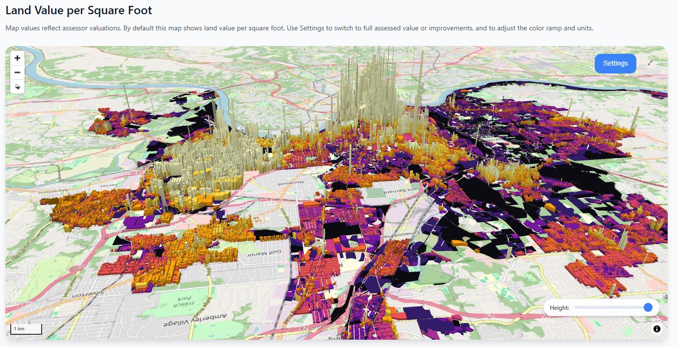
The answer is over 100 times1. Land value in Manhattan literally towers above everything else:
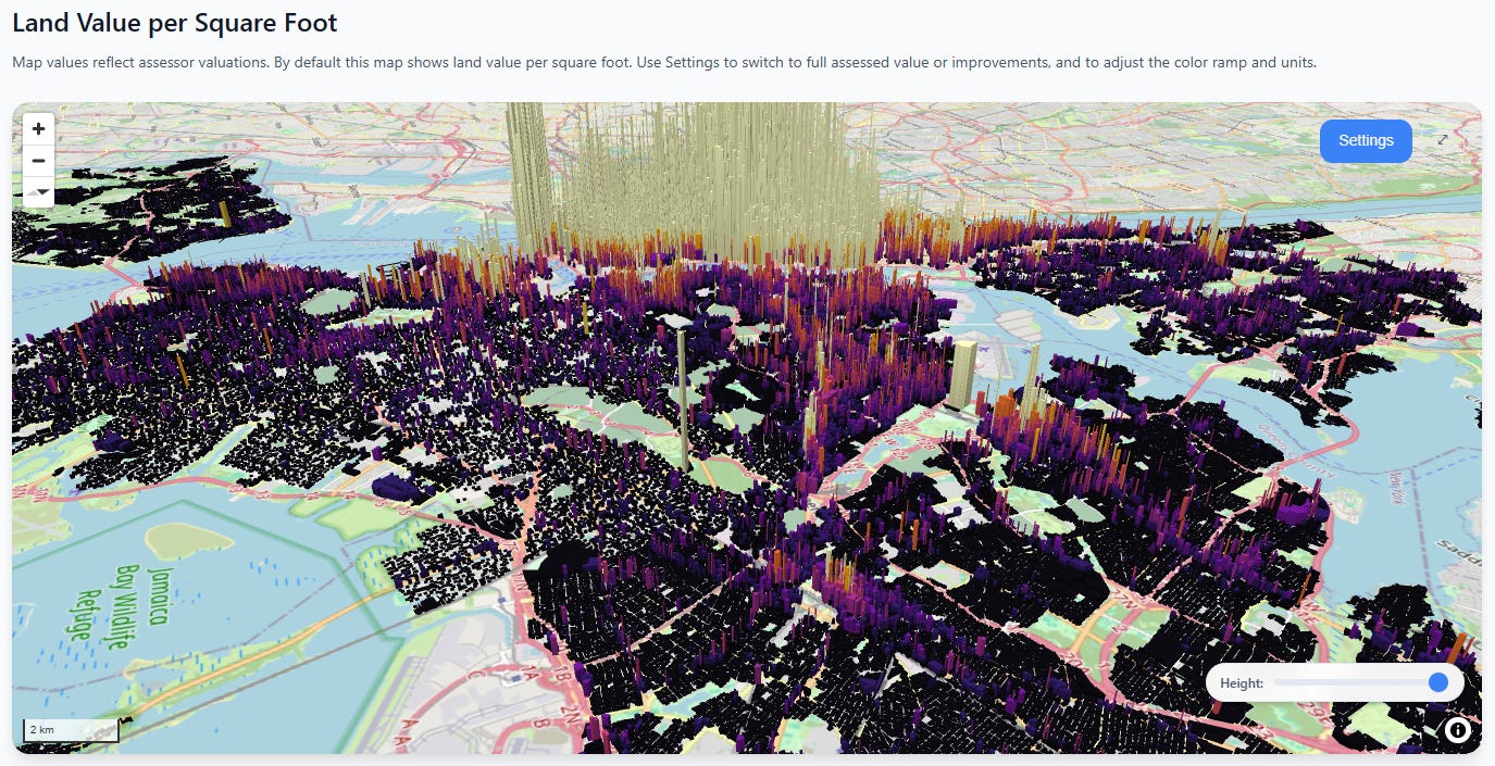
Note that this comparison takes the assessed values at face value—New York real estate is widely known to be under-assessed in general. Nevertheless, the assessed land value of Manhattan is greater than all of the rest of New York City combined.
Okay, but maybe this is just New York City. Surely this is a unique pattern and we’d see something different elsewhere in the state?
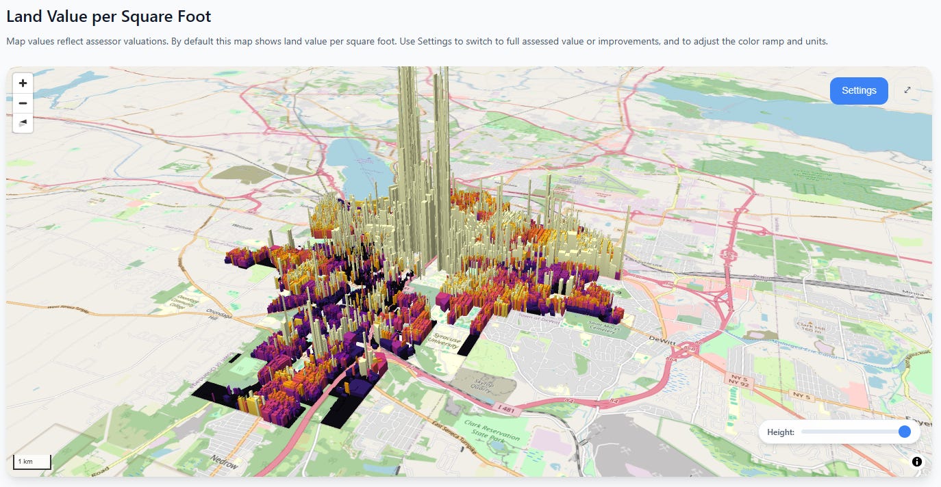
Syracuse
Rochester
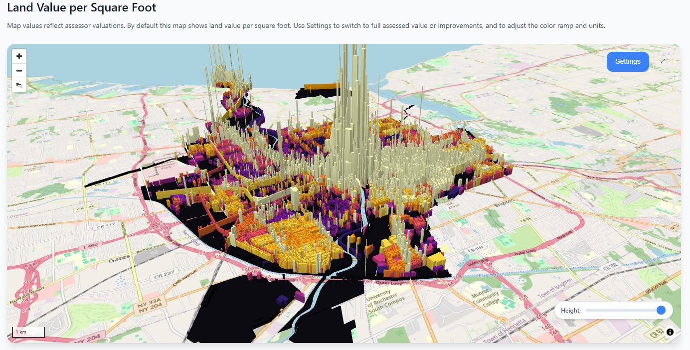
The absolute values are much lower, but the same basic pattern persists—the closer you get to the city center, the heart of economic activity, the more land values go exponential.
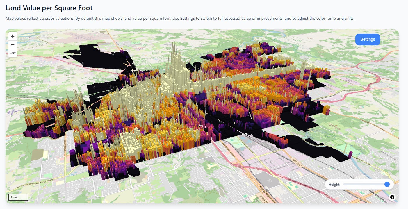
And in case we’re tired of New York state, let’s fly to the other side of the continent to Spokane, Washington. Here we see a less extreme ratio, but there’s still an unmistakable “towering fortress of land value” in the center of the city, not to mention a long thin wall of value marching north along the commercial corridor.
Spokane
Next, let’s hop over to middle America. Here in Cincinnati we see two clusters, both concentrated towards the Ohio river, with value gradients that quickly decay as you leave the city center(s).
Cincinnati
In these cities, you can reproduce the same 10x, 20x, even 100x difference in observed land value rates between the central and outlying areas.
I have two points I’m trying to make here:
People have wildly incorrect intuitions about where land value is concentrated
Putting values on a map is the best way to fix those misconceptions
This has been an essential part of our advocacy efforts at the Center for Land Economics, and it’s why we built CivicMapper, the tool which produced the above images:

Speaking of CivicMapper, we’ve recently added some great upgrades to it, which are already live on the CivicMapper.org site. We’ve also greatly expanded its open source companion tool, PutItOnAmap.com (PIOAM). We use these tools all the time, and thought we’d do a deep dive on them so others can take our tools and use them in their own work.
Altogether we have FIVE free tools to talk to you about today:
New & Improved Civic Mapper
PIOAM visualizer
PIOAM GIS Data Fetcher
PIOAM GIS Format Converter
PIOAM GIS File Constructer
Before we get into all that, a quick request:
Please help us keep building this stuff
Ever since we started, people have been asking us to add their city to Civic Mapper, to expand OpenAVMKit, and to build more GIS tools. We’re doing our absolute best to keep up, but the requests keep coming in and it’s expensive and time consuming to keep producing technology like this and also to pay the hosting fees. If you want us to keep pumping out a steady stream of great free software, please consider donating to the Center for Land Economics:

Now let’s get to the goodies, starting with new CivicMapper features.
CivicMapper
We recently relaunched the website so that it has an actual proper landing page, complete with silly interactive 3D gimmick (the blocks wiggle when you mouse over them):

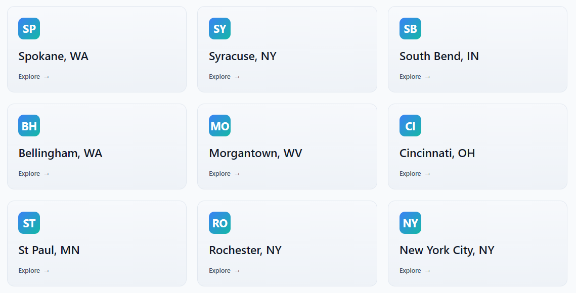
Next, we’re now up to nine cities, and adding more as fast as we can manage. Our latest additions include Cincinnati, St. Paul, and New York City:
The sheer scale of New York City forced us to stop procrastinating and build an actual vector tiles pipeline, but now that we’re cleanly over that hump, we feel more confident in adding other large cities. Each city page is fed by a data pipeline that transforms public open data sources into our internal format, and the next big project is automating that process so we can rapidly add new cities in hours, not days.
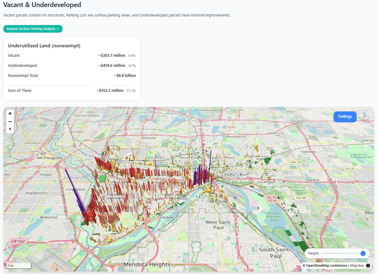
Vacant & Underdeveloped Analysis
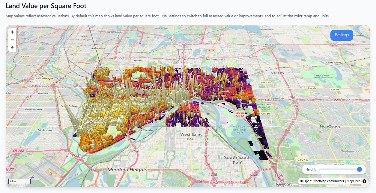
We’ve significantly improved the vacant land analysis feature, which should be available for every city on the site. Upon first load, you will see the main view of the city’s land values. Here’s St. Paul, Minnesota:
Scroll down and you get a filtered view. The parcels shown in this view are either vacant lots with no structures, lots specifically identified by the assessor as parking lots, and lots with very small structures relative to their overall land area. This is a great way to show elected officials how much development potential in the most valuable areas might be going to waste:
Click on the green “Explore Surface Parking Analysis” button and you will get a special analysis view, which specifically identifies surface parking lots.
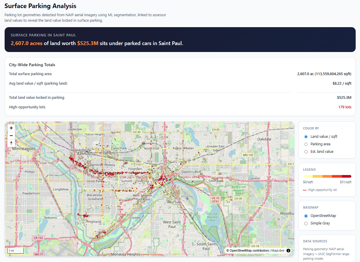
Our pipeline fetches data from publicly available satellite imagery (NAIP), then processes it with an open source computer vision model that specializes in parking lot detection. We found it on HuggingFace, based on the excellent paper “A Pipeline and NIR-Enhanced Dataset for Parking Lot Segmentation”, by Qiam, Devunuri, and Lehe, 2024. This solves two problems:
Assessor data doesn’t always cleanly or consistently identify parking lots
Many large parking surfaces are technically portions of a larger commercial parcel with a small improvement on them, so naively looking at parcel-level land vs. improvement square footage can miss large parking surfaces.
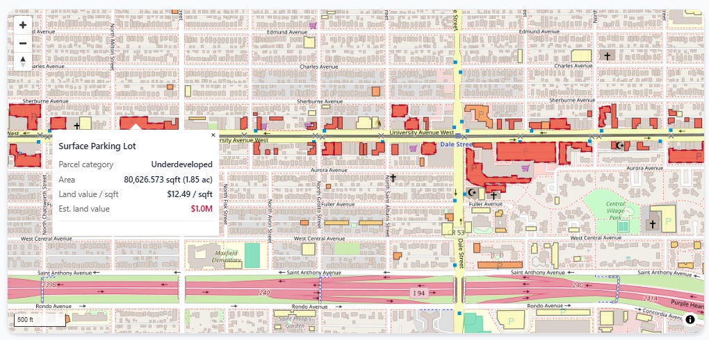
We join the polygons the computer vision model identified as surface lots to our underlying assessor parcels, which lets us price how much land value is tied up in parking. You can zoom in and inspect each lot individually:
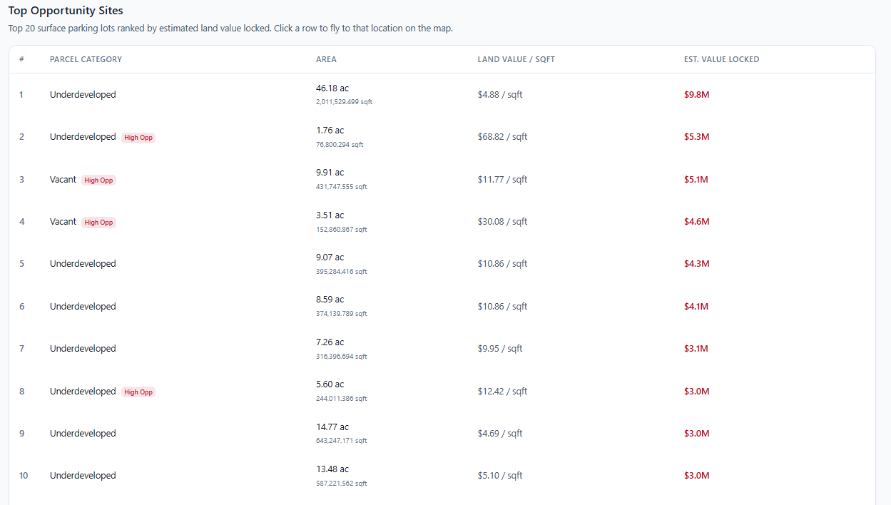
Just below that is a table of the top 20 parking lots ranked by total land value:
If you’re thinking, “Hey, that looks a lot like those maps from the Parking Reform Network!” you’d be absolutely right:
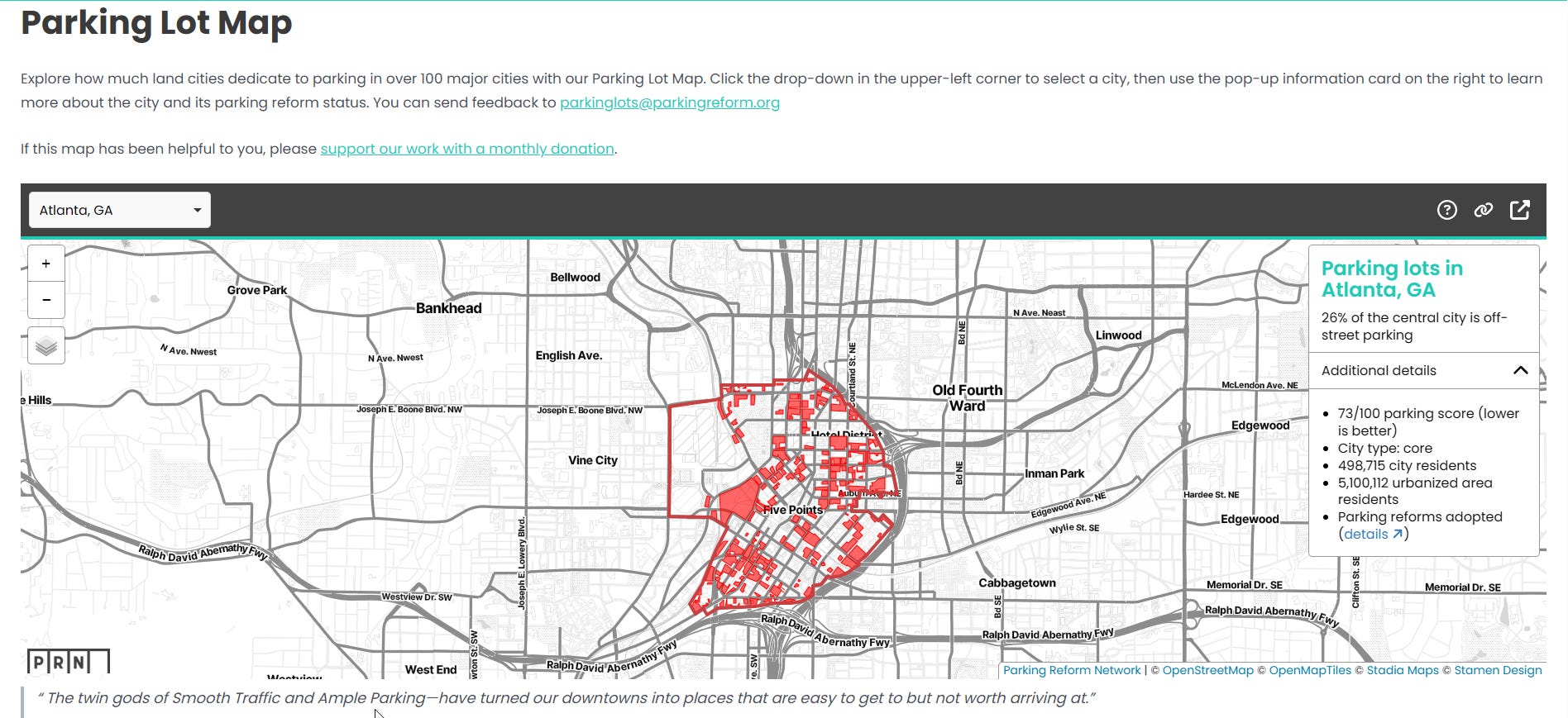
We were directly inspired by PRN, whose co-founder Tony Jordan is on our board of advisors here at the Center for Land Economics. Our hope is that these tools can benefit not just those of us interested in Land Value Return, but everybody in the greater urbanist movement—such as PRN!
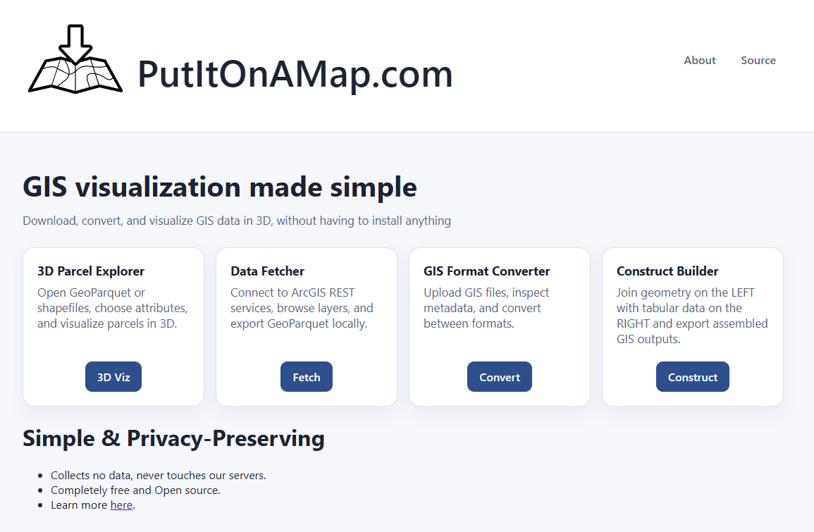
That brings us to our second suite of tools, Put It On a Map (PIOAM).
Put It On A Map
It’s not just a slogan, it’s a website! PIOAM started as the same 3D visualization engine that Civic Mapper was built from, but has quickly evolved beyond that into our own in-house “GIS Swiss Army Knife” that we keep adding small standalone tools to. The entire suite is available free and open source under the permissive MIT License.
These tools solve common day to day GIS problems and work around some of the clunkier aspects of QGIS2 by just doing the exact thing we want.
The philosophy behind PIOAM is to do as much work as possible entirely locally in your own browser, with absolutely nothing sent to any servers that we control3. Not only do we not grab or store your data, we don’t want your data, because of the liability it would incur. PIOAM is just a standard productivity app that happens to run in a web browser, where all the actual logic runs on your own machine. For maximum control, nothing stops you from downloading the source code and running it entirely on your own computer or office intranet. Ask your IT person to take a look if you don’t believe us.
So far, PIOAM consists of four tools:
3D Parcel Explorer
This is the same 3D visualizer engine you’ve seen in Civic Mapper. It’s local-only and requires you to bring your own data, but it has more analysis tools.
Data Fetcher
What’s the point of fancy GIS tools if you don’t have any GIS data? If you know where your local government stores its open data, this lets you quickly and easily fetch that data straight from the source, then save it out to the same format our tools use.
GIS Format Converter
Got GIS data, but it’s in the wrong format? Never fear, just plop it into this tool, select your output format, and save the result.
GIS File Constructor
If you have two files, and you want to join them together, this will let you do that without requiring you to learn SQL or python. Just drag, drop, click, and export.
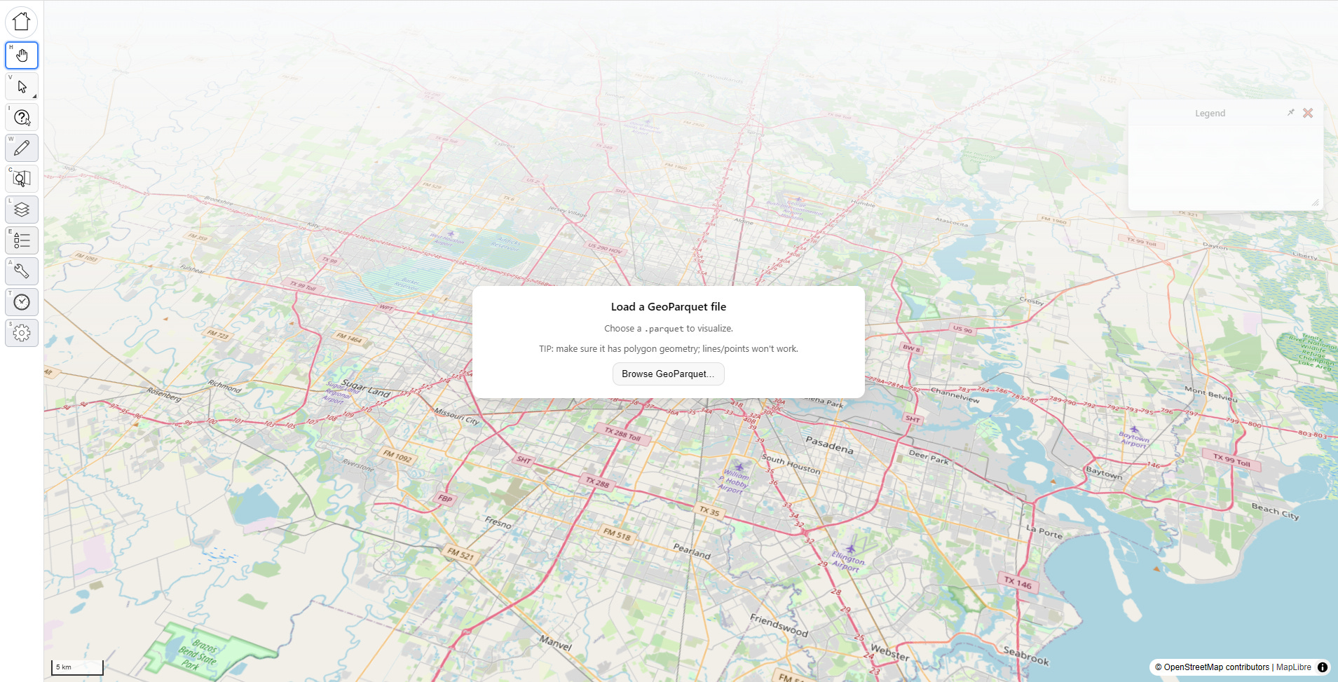
Tool #1: 3D Parcel Explorer
This is our big power tool. The interface opens by asking you upload a parquet file:
Once you’ve selected a file, a pop up asks you to identify key fields, and the computer will try to make educated guesses for you to classify them. You don’t have to do this, and you can change your choices later, but doing so will unlock extra features. You can also pick which fields to load to cut down on file size.
WARNING: large files can kill your memory, so try to stay lean, or create a file that only contains a subset of your large jurisdiction. In practice, unless you have a tiny jurisdiction we’ve found that the current version of this app works best for analyzing a subset (such as a few neighborhoods or one big market area at a time, or just your sales rather than every parcel in town). We’re working on ways to make it scale better.
Visualizing Something
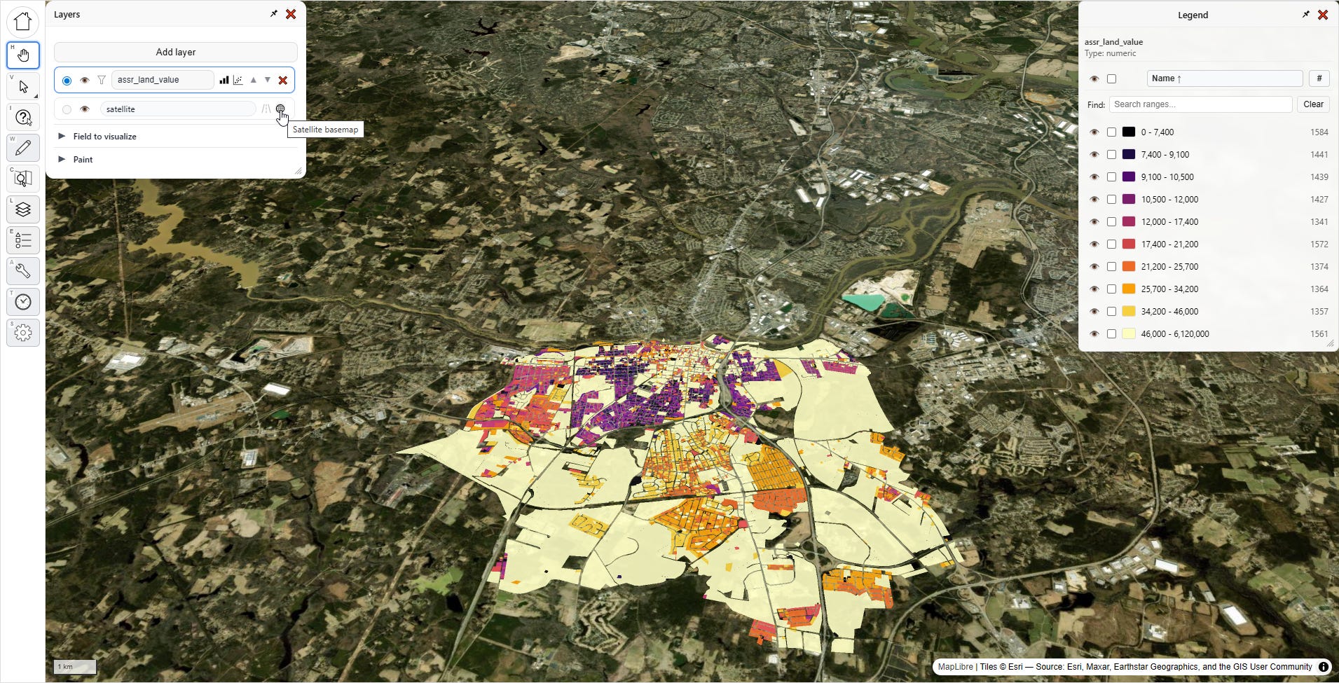
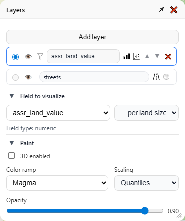
Let’s reproduce the Civic Mapper visuals. In the “Layers” menu, under “Field to visualize”, I pick “assr_land_value,” which represents assessed land value in my file (your file will almost certainly have something different in it).
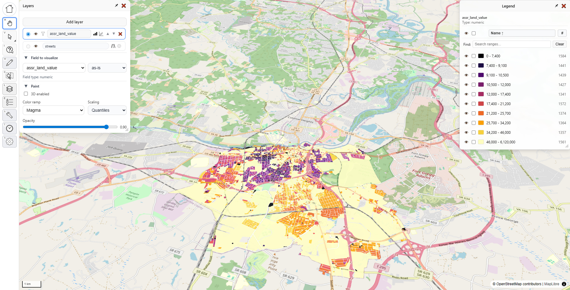
Once I do that, the map gets some color, and both menus change. Let’s look at what’s going on:
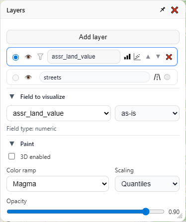
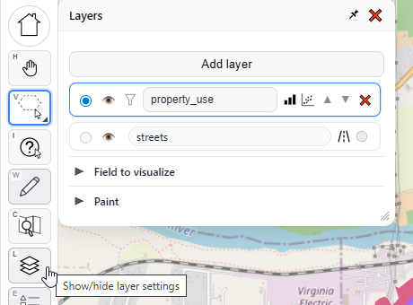
There are three sections to the “Layers” menu — the layers themselves up top, then “Field to visualize” and “Paint” below (clicking on the ▼ symbol will collapse/hide any sub menu). Lets go through each section one by one, starting from the top:
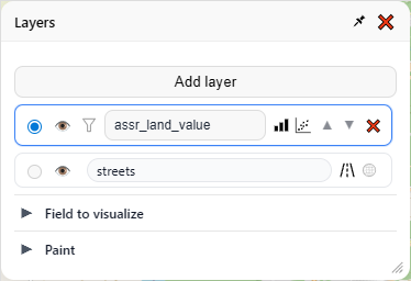
I have only one layer, and it’s currently visualizing “assr_land_value.” Then there is a special layer beneath it for the base map. The base map layer has two buttons — one to show the open street map view, and the other to show a satellite view. Clicking the eye for any layer will hide that layer entirely. Then there’s some additional buttons on the main layer widget itself, but we’ll save those for later.
Now let’s look at “Field to visualize.” Notice there’s a dropdown that says “as-is”, we have two other choices in there, “…per land size square feet” and “…per building size square feet.”
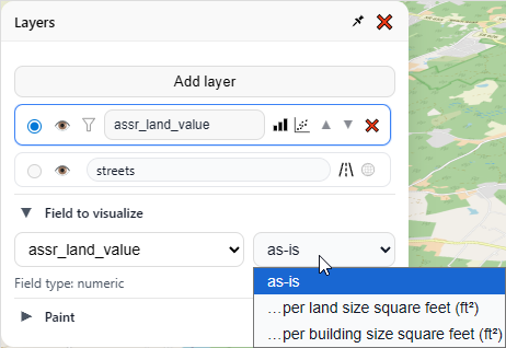
These latter two options are only available because of the field classifications we made at the beginning of the app (and yes, it supports metric units). These classifications can be changed at any time in the settings menu. For now let’s pick “…per land size square feet.”
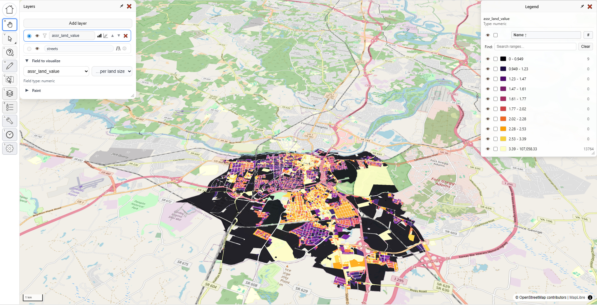
Now our map looks like this, the colors represent assessed land value per land square foot:
That’s cool, but it’s not impressive. Let’s open the paint options:
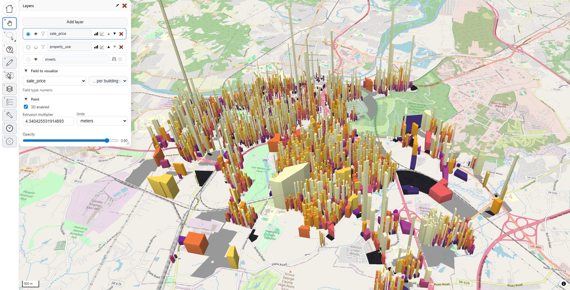
Here we can change the color scheme, and how it decides how to distribute the gradient across the value range. We can also control the opacity of the map layer, which is useful when you’re working with multiple layers. I’m going to keep the default options, and click that fancy “3D enabled” box:
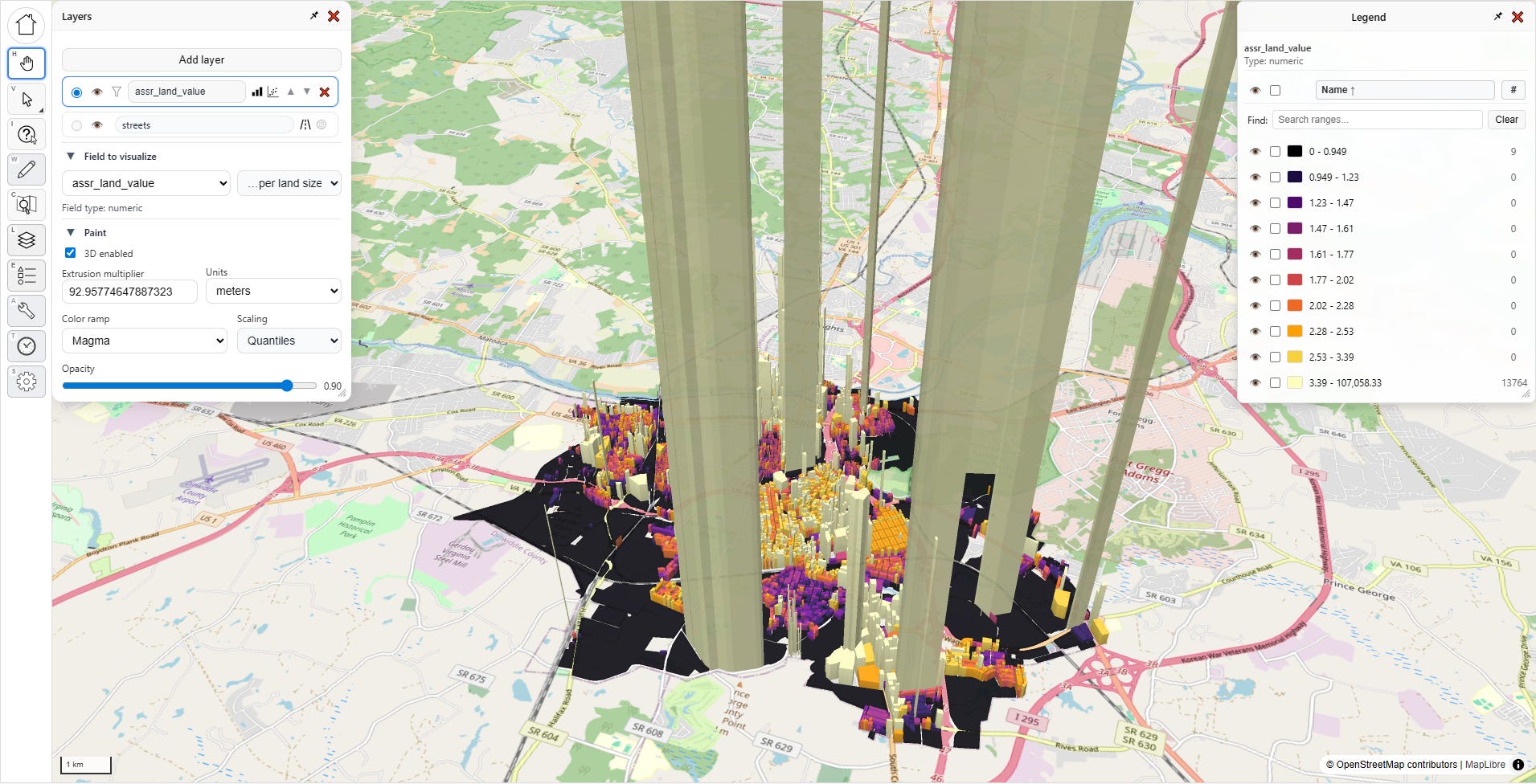
Whoa! What’s going on? What’s with those towering columns of land value? Is this jurisdiction giving Manhattan a run for its money?
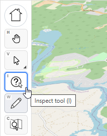
No, this is the humble city of Petersburg, Virginia, which is not breaking world records for land value; there’s something fishy going on with the data. On the left side of the screen are all of our tools. Let’s select the third one down, with the question mark, that’s the “inspect tool.”
With that selected, let’s click on one of these anomalous parcels:
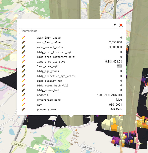
Whelp, there’s our problem. The assessor’s official land size for this parcel is a mere 251 square feet, which given the $2 million dollar land value would put it at a whopping $8,170/sqft, putting prime Manhattan real estate to shame. Clearly, this is misinterpreted data (maybe 251 is supposed to mean “acres?”). I need to use a different field.
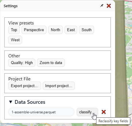
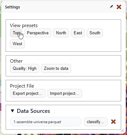
I click “settings”, which spawns a new menu:
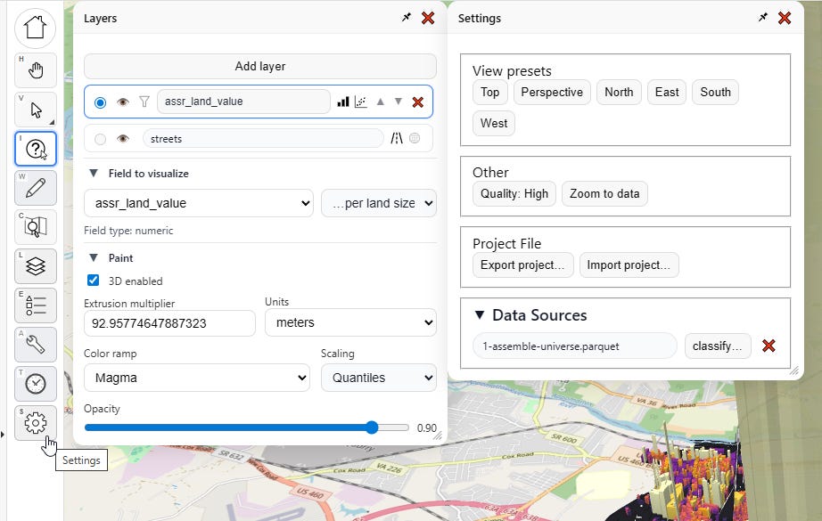
I go over here to “Data Sources” and click “classify…”
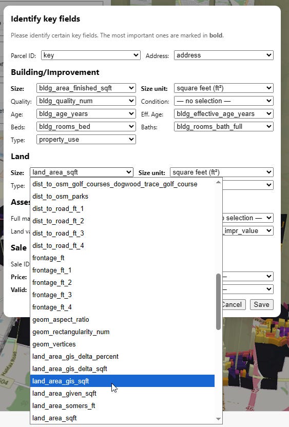
Then I change the land area field to “land_area_gis_sqft” instead:
I do that, close the menu, then go back to the “Layers” menu, and re-select “as-is” then “…per land size” to reset the visualization. Boom, now things look less insane:
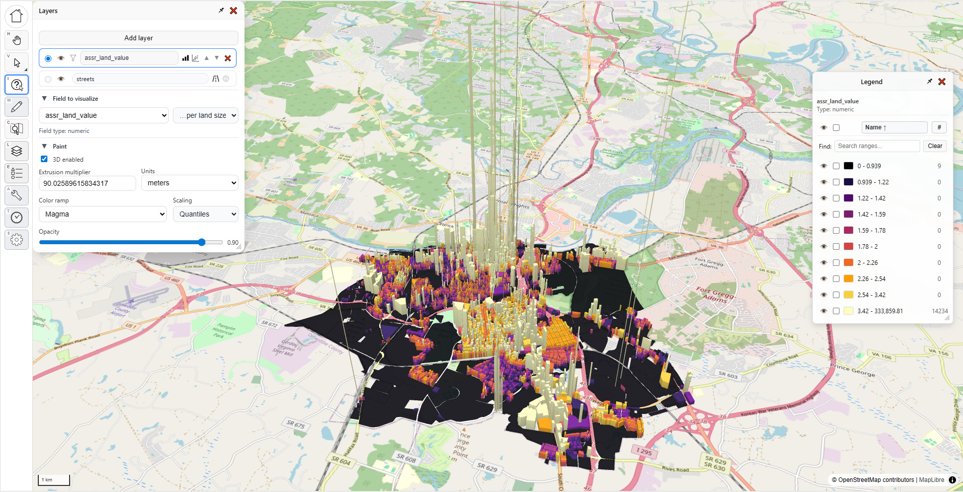
This is a much more intelligible map of land values, with the typical pattern I’ve seen in all the other cities. With a little bit of cleanup, I could produce a nice presentation-worthy screenshot of Petersburg City, Virginia (or any other city for that matter).
NOTE: You can’t yet save, host, or send shareable online links to the maps you make with PIOAM’s visualizer yet— but you can at least make screenshots. We’ll build out more features soon.
Going back to our visualization, I notice a few super-tall “pencil” anomalies with extremely skinny bases that I don’t think reflect true reality. This is actually another thing the app is useful for—on a flat map, these outlier parcels are much harder to notice. They can also easily hide in a spreadsheet or database, but on a 3D map, they become super obvious. So much data cleaning work comes down to just narrowing down which parcels are likely to have issues, so this is another tool for quickly locating those.
If you get tired of the 3D view and want to go back to a regular top-down map, do this:
In “Layers” / “Paint”, uncheck the “Enable 3D” checkbox
In “Settings” / “View Presets”, click the “Top” preset to flatten the camera perspective:
Now that we’ve got our basic visualization task done, let’s revisit those little buttons in the layers menu:

Statistics
Let’s click on the three bars first. This launches the “Statistics” menu for that layer:
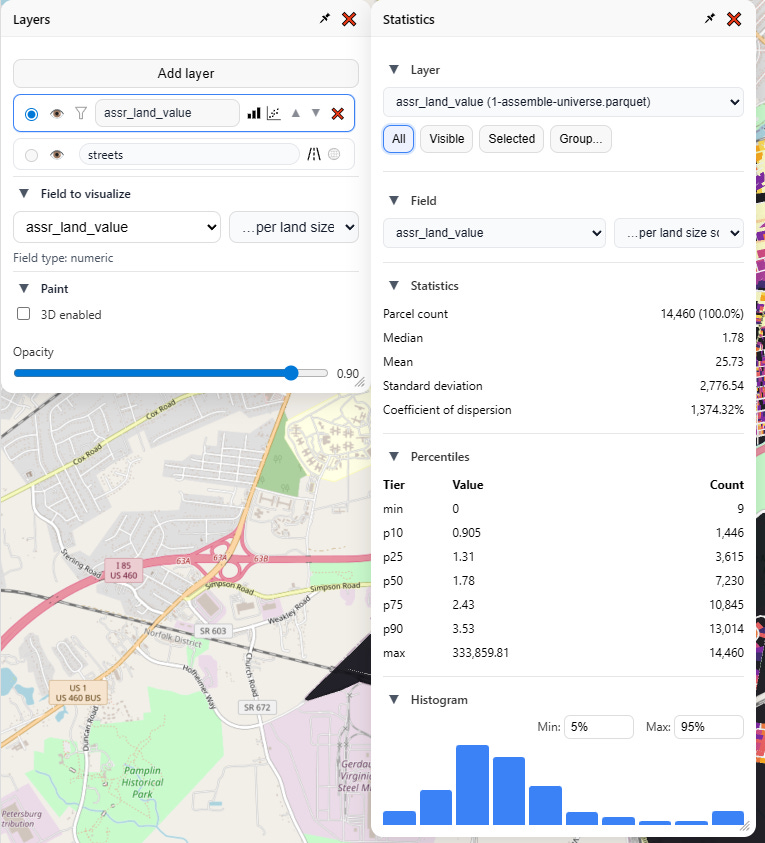
From here I can analyze any of my numeric fields, and, just as in the visualizer, view that as-is, or denominated per land area or per building area. I get a readout of all the usual summary statistics, as well as percentiles and a visual histogram, complete with configurable overflow and underflow buckets.
Note also these buttons on top, which controls what parcels are in the selection driving the statistics:
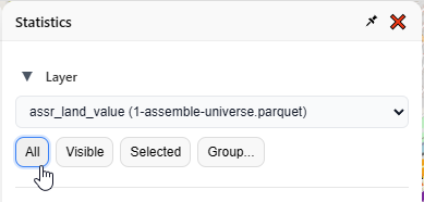
All: every parcel in this layer
Visible: every parcel that’s not currently hidden
Selected: every parcel selected on the map
Group: pick a field and value(s)
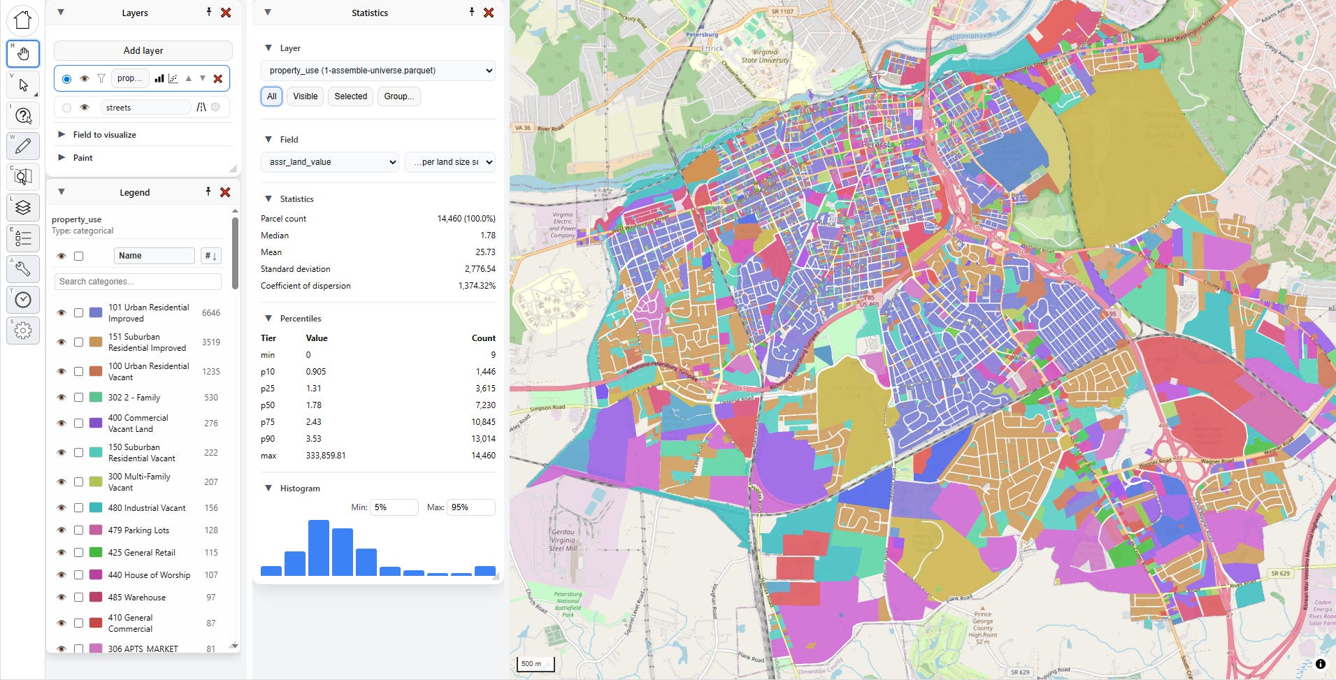
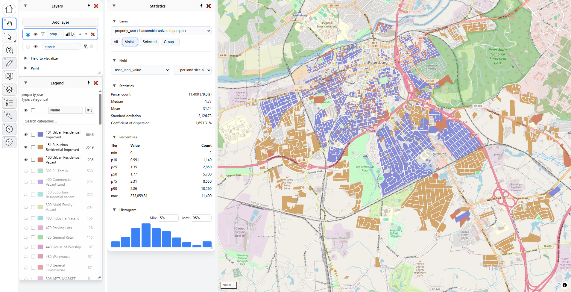
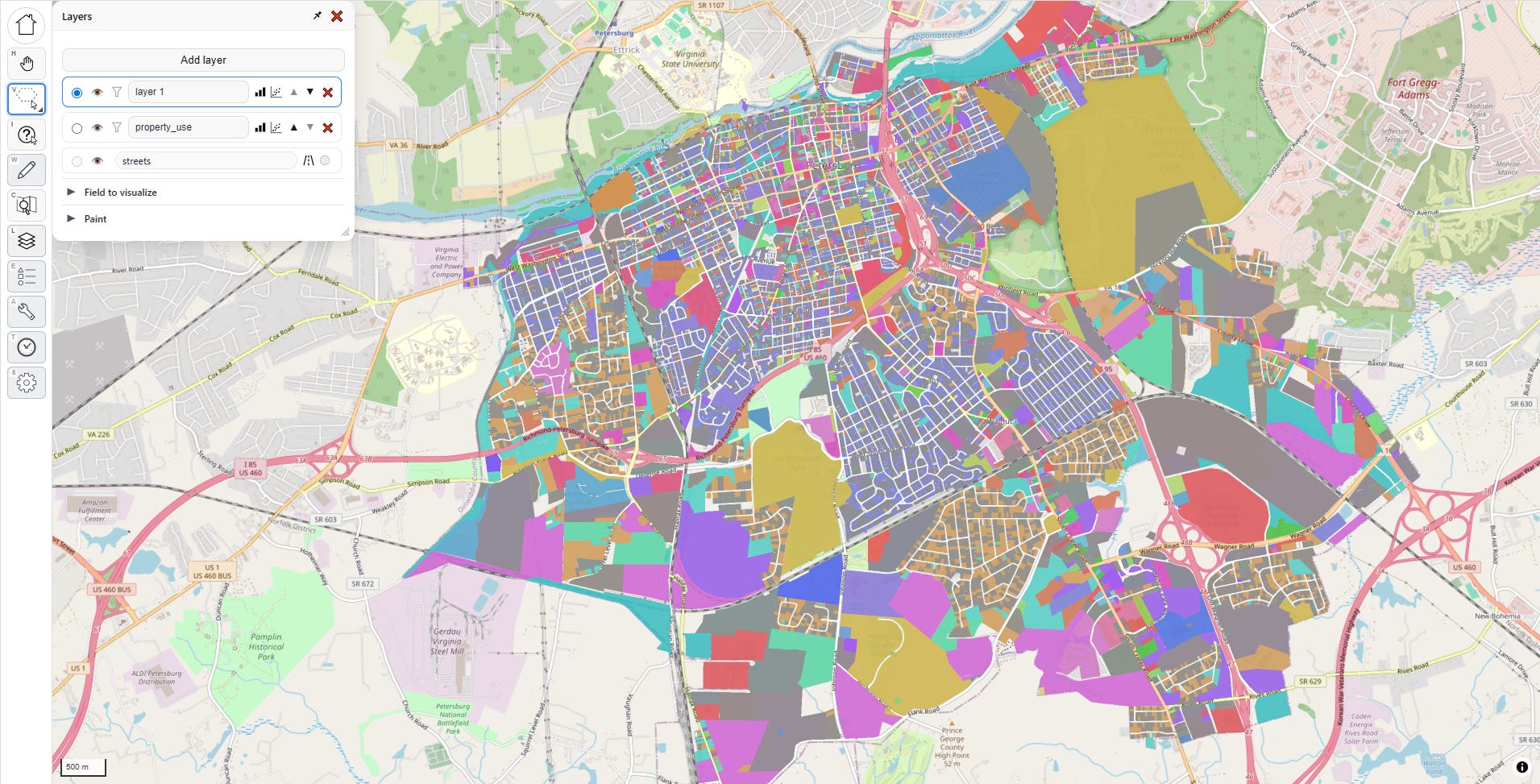
To give you an idea of how powerful these tools are, let’s go through a couple workflows. First, let’s select by visibility. I’m going to the layers menu and selecting “property use” as the layer visualization. This is a categorical field, so it just assigns a unique random color per category.
After a little panel rearrangement, I have this:
See these little eye buttons in the Legend? They let me show/hide the corresponding category on the map.
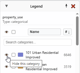
If I hide everything except “101 Urban Residential Improved”, and then pick “Visible” as my selector within “Statistics”, the numbers and graph update in real time to correspond to what is visible on the map:

If I show a few more categories, both the map and the statistics change again, instantly:
You can also look at statistics by group, and this is one of my favorite methods. Pick a field, and then pick a value. Here I’ve picked “property_use,” then “101 Urban Residential Improved.”
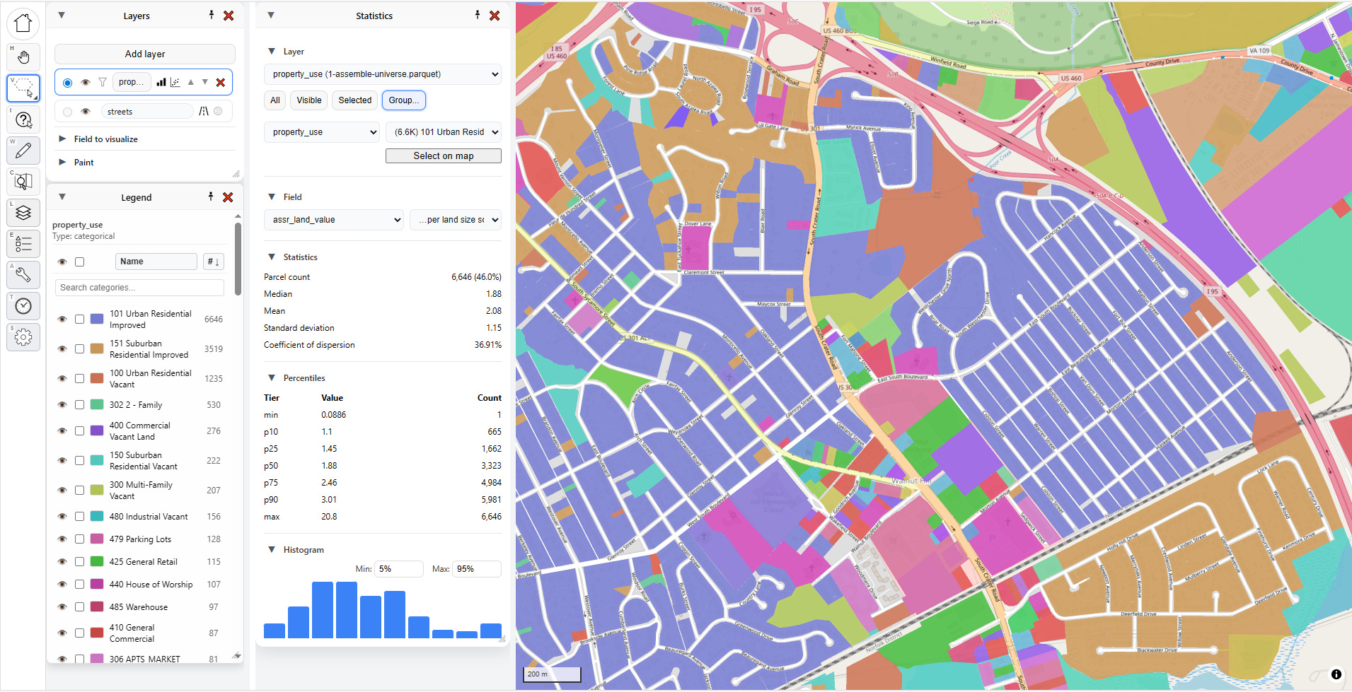
I can click “Select on map” to highlight all those parcels, but what I really love to do is to just select the second dropdown and hit the “down” arrow on my keyboard and move through each category, instantly seeing the statistics update:
But what if I’m only interested in one particular area? That’s where “Selected” comes in handy.
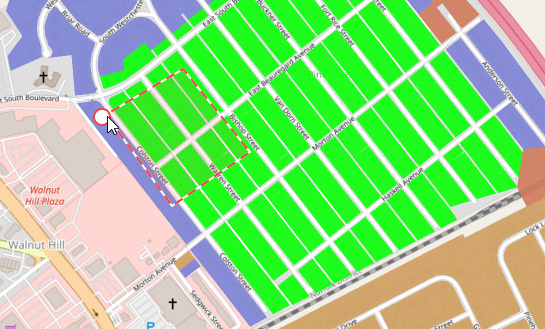
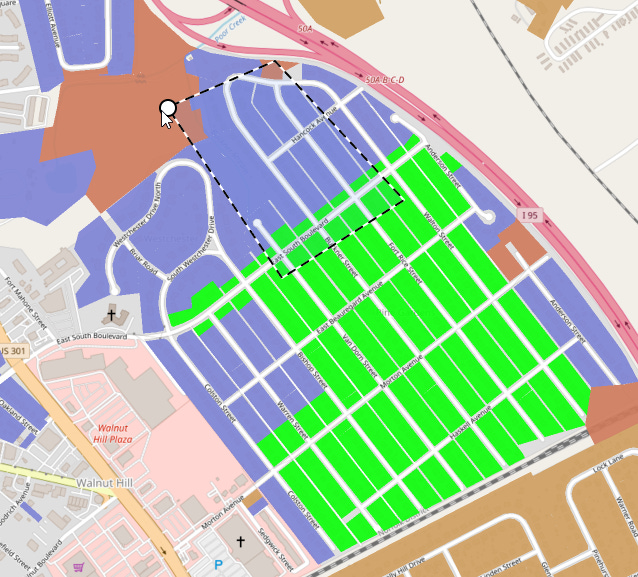
Let me select a few parcels in one particular neighborhood. For that I go to my selection tool. If I click and hold on the select tool, I get several options:
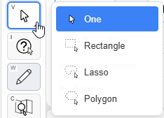
Let’s pick the “Polygon” tool and grab some parcels:
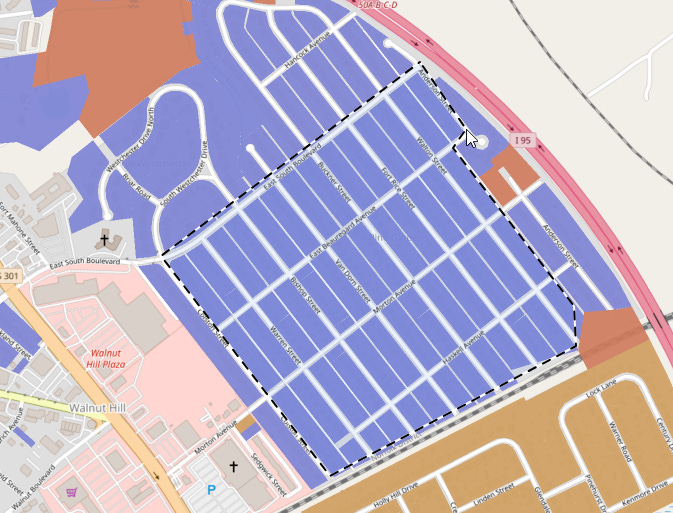
Clicking on the same point I started at completes the selection, with a handy circle showing up to give me visual feedback:
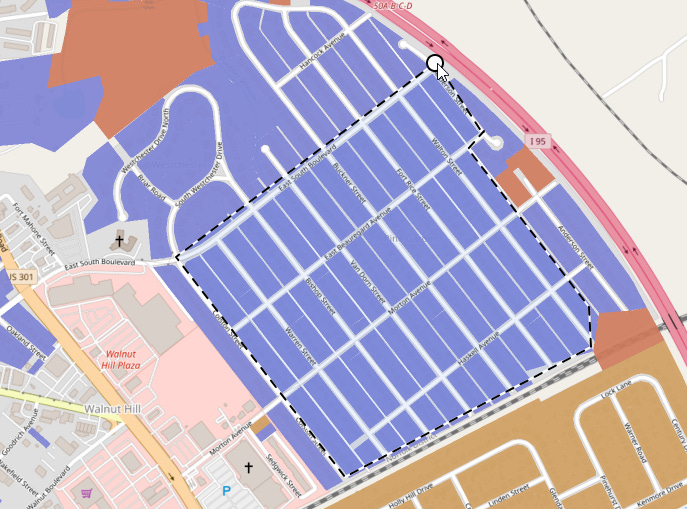
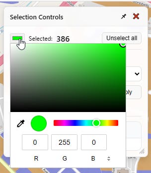
Now some parcels on the map are selected, highlighted here in green. The selection controls pop up to tell me what I’ve got selected and provide me a handy button to unselect them.
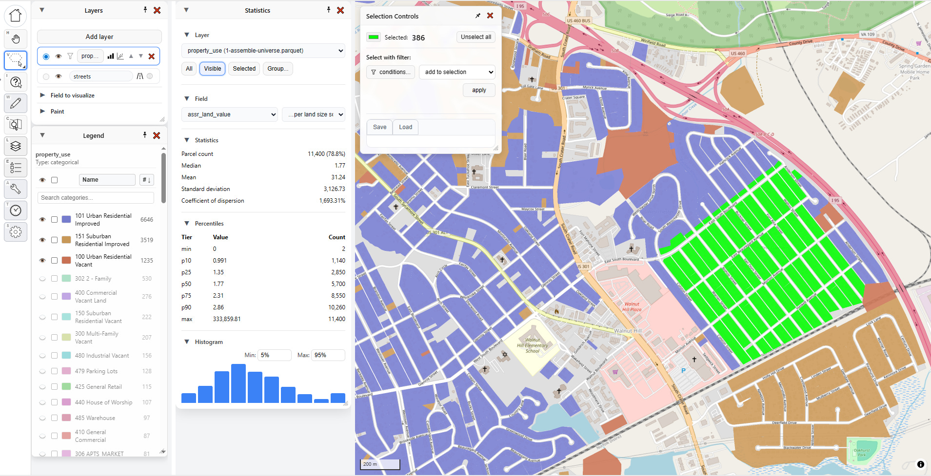
If I change my Statistics selector to “Selected,” then these specific 306 parcels highlighted in green will drive the statistics for me. As you can see in the statistics panel, the land values are clustered in a tight range, absent a few outliers.

ASIDE: Selection Tools are Super Important
Humor me for a minute while I go off on a rant about selection tools.
Whenever you’re doing GIS operations, being able to precisely and quickly select the parcels you want, and deselect the parcels you don’t want, can make the difference between a workflow that takes seconds and a workflow that takes minutes or even hours. I’ve spent a lot of time dialing in the selection tools for PIOAM with the aim of making it my own personal “Photoshop for GIS.” Here’s a list of particular things I’ve added to make my life easier.
First, four selection modes:
Point (click one thing at a time)
Rectangle (click and drag a box)
Lasso (click and drag to draw a loop)
Polygon (click sequential points one by one, then close)
Additionally, all of these tools support both additive and subtractive selection, so you can quickly use them together to craft complex selections. If you press and hold ALT as you select, the selector will turn red and signify that you are removing parcels from your current selection:
Meanwhile, pressing and holding SHIFT as you select will add parcels to your selection.
Another thing that has always bugged me about QGIS is that selected parcels are always yellow, which can be troublesome if you use yellow in your underlying map layer colors, and I never figured out how to change that. In PIOAM, the “Selection Controls” menu opens whenever you select something, and it lets you change the selection color as needed:
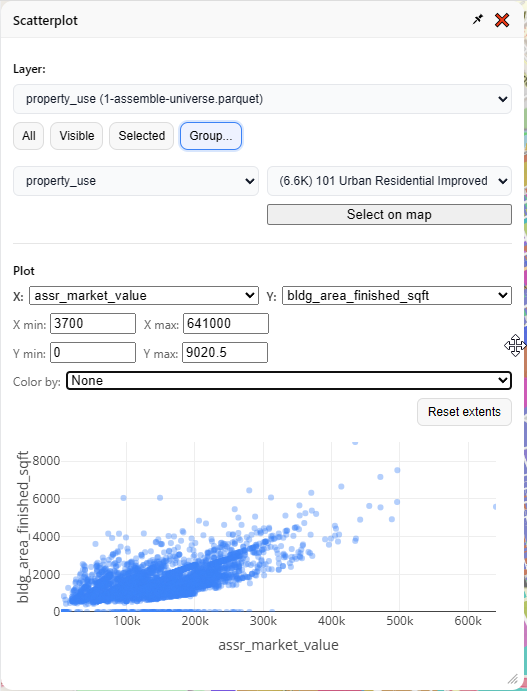
Scatter Plots
Going back to the layers menu, let’s click on the button right next to “Statistics,” which is “Scatterplot.”

Unsurprisingly, this generates a scatterplot. It has the same basic “selector” interface as the “Statistics” menu, but instead of statistics it draws an X vs. Y graph. You define which fields represent X and Y, and also what subset of your data you want to plot.
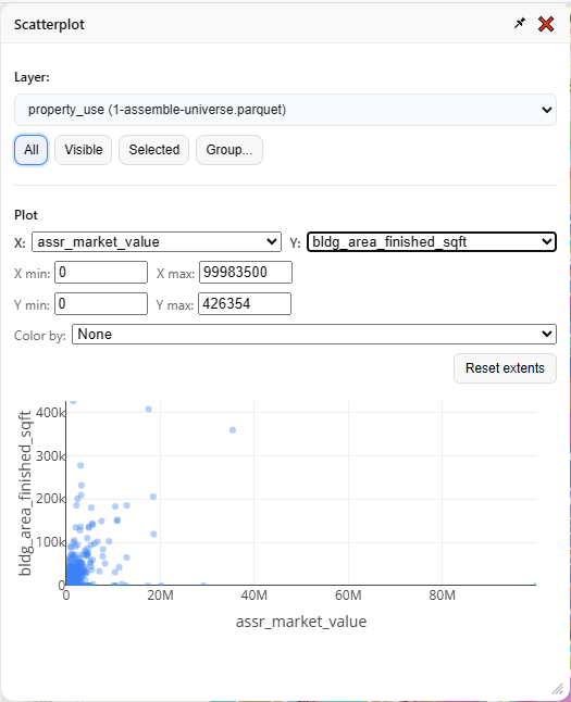
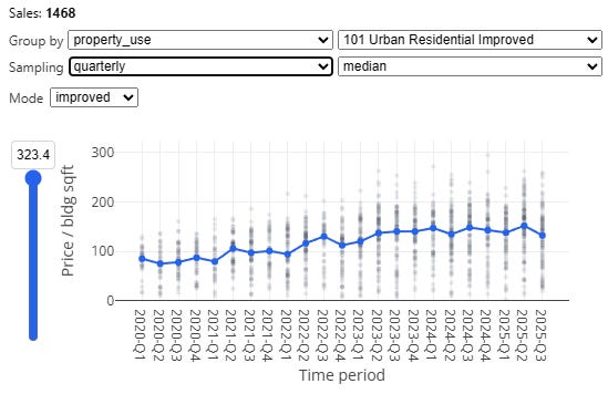
It’s usually best to narrow your focus to one kind of thing at a time, so let’s look at “101 Urban Residential Improved” again:
So far, so typical. You can stick some things on a map, you can paint them with pretty colors, you can select some things, and you can look at the same bog standard summary stats that anyone with a Power BI dashboard could also cook up in five minutes. What else can this tool do?
Two particularly useful mass appraisal tasks, namely:
Generating time adjustments
Finding and displaying “comps”
Time Adjustments
Generating time adjustments is an essential task for any assessor or mass appraisal specialist (for a refresher on this basic topic, see this section of our previous article).
In a nutshell, the market moves over time, and the same property might sell for significantly more or less in January than it would have the previous July. Therefore, when we estimate “market value,” we estimate that value as of a specific date, typically January 1st. That means if we’re going to take several years of sale prices and feed them into a regression model or any other prediction algorithm, we will want to “time-adjust” the prices first, so that we not only account for observed market trends over time, but also yield predictions calibrated for the valuation date.
There’s several methods for doing this, which we implement for you in PIOAM’s time adjustment tool. Here’s how.
First, we need to upload some sales. So far, we’ve only been playing with “parcel universe” data — the actual parcel characteristics, but lacking any transaction data. Fortunately we can add new data, such as sales, anytime. We click “Layers” to bring back that menu:
Then we click “Add layer”, and “Browse for file…”
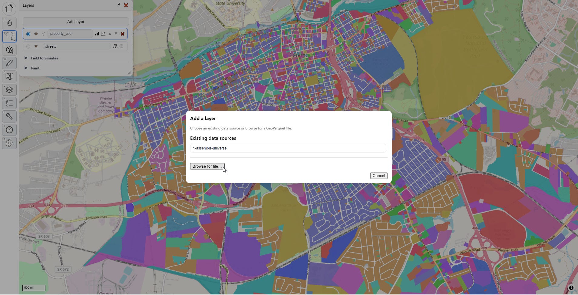
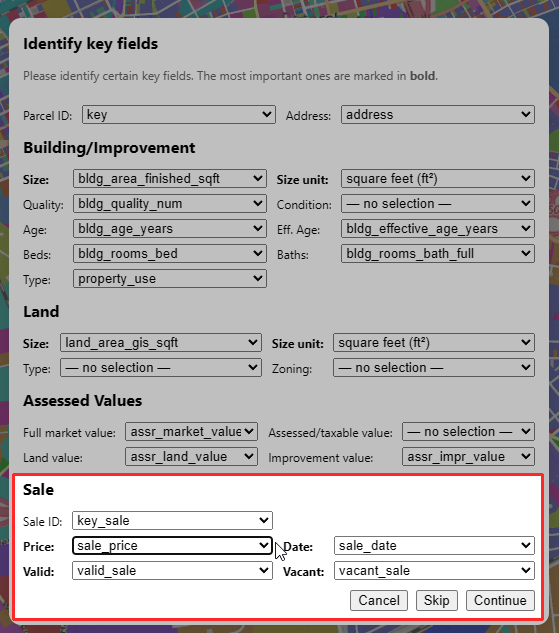
I grab my sales transaction file, which includes sale prices, sale dates, and property characteristics as of the date of sale. The menu tries to auto-detect the essential fields, and finds them. However, this time it also finds sale data, which the “parcel universe” file didn’t have:
I load in the new sales file, and it’s automatically added as an additional layer to my map, defaulting to gray, overlaying my parcel universe (the random colors):
I’m going to hide the underlying universe layer for now and set the sales layer visualization to “sale price per built square foot,” then I’ll enable 3D, just for fun:
Now, let’s do some time adjustment. I click on the time adjustment tool…
…and, it’s already calculated as soon as I open the menu. That was fast!
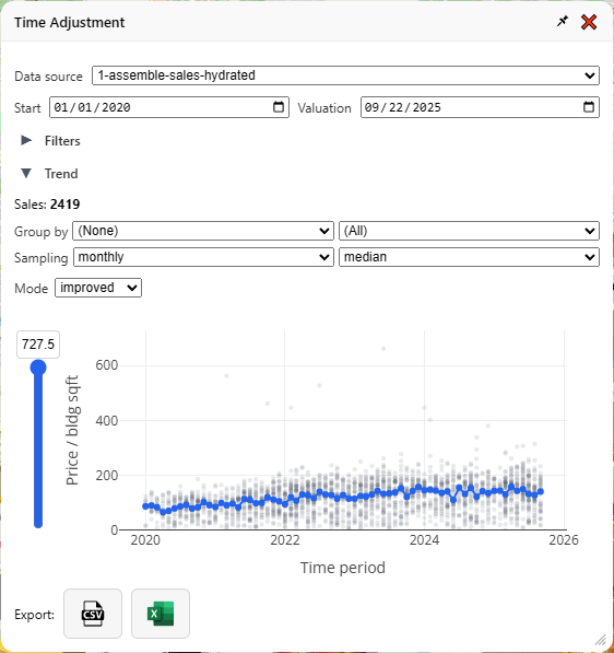
Let’s zoom in on that graph and explain what’s going on here, then I’ll explain all the fiddly bits in the menu. First, let’s hide everything but the graph:
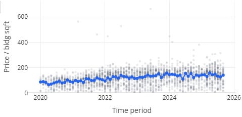
Each gray dot is a sale. The vertical position is the price divided by the (built) square footage—therefore, this is only a graph of improved property sales, and in case there was any doubt, the little dropdown labeled “mode: Improved” makes that clear. If you have enough samples you can also analyze vacant land sales the same way, in which case it will use land area as the denominator.
The horizontal position is the time of the sale. The gray dots are partially transparent, so when more sales happen at a particular time and price range, the darker that group of dots will appear as they stack up. The blue line is the time trendline that forms the basis for our “time adjustment.” In January 2020, the median price/sqft was $88.12, and in September 2025, it was $141.60, a more than 60% increase.
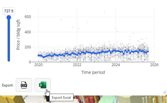
At the bottom of the menu we have two buttons — one to download as CSV, and one as Excel:
Those will generate spreadsheets that look like this:
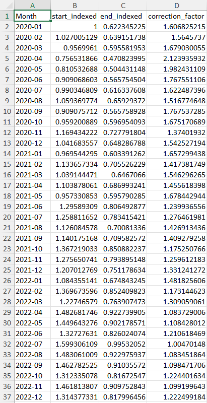
Multiplying a sale price by the “correction_factor” for its time period will bring it up to the same price level of the final time period, while “start_indexed” and “end_indexed” provide you with numbers that make for nice looking charts, comparing price levels at different times in percentage terms relative to either the first or last time period in your series.
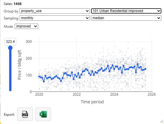
With no grouping, we are lumping all our property together, which isn’t super useful. We should zoom in to a specific category, like “101 Urban Residential Improved” for a more specific time adjustment:
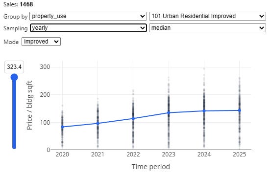
Next, note the “sampling” dropdown. If we have a ton of data, we can create fine-grained monthly time adjustments which capture inter-year seasonality effects, but as our sales get sparser we should be more conservative, and reduce overall noise by chunking by quarter or even by year:
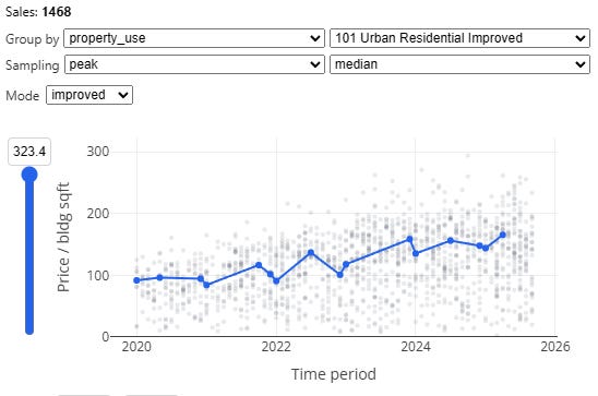
We also have a special “peak” method, which samples the beginning and end of each year, with a floating midpoint in between, which is often called as a “spline” in this context. This particular method is based directly on an approach described by the Florida Department of Revenue’s time adjustment training materials for local assessors4.
Additionally, median sampling isn’t the only choice. You can also pick “mean” (average), as well as “regression.” The latter will do an ordinary least squares regression using dummy variables for each time period as your independent variables, against log sale price per unit area as your dependent variable (this method is also based directly on the method described in the Florida DOR time adjustment training materials).
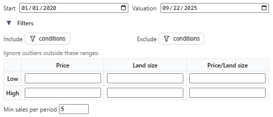
If you want to go further, or if you want to dial in the settings to comport with local standards, you can specify inclusion and exclusion filter criteria, specify a custom start and end date, set outlier exclusion rules, and impose a minimum sales threshold for time period sampling:
We hope this tool will be flexible enough to accommodate whatever the local jurisdiction’s standards are. If yours needs something different, don’t hesitate to reach out and we’ll add it in!
Let’s move on to the comp-finder.
Comp-Finder
This is the second big feature that’s core to a lot of mass appraisal workflows. You invoke it by clicking on the “Comp Finder” tool on the left toolbar. This invokes the “Comp Finder” menu, which is blank until you click on a parcel.
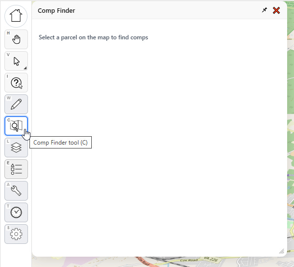
With the comp finder tool selected, I select a parcel on the map. Now it looks like this:
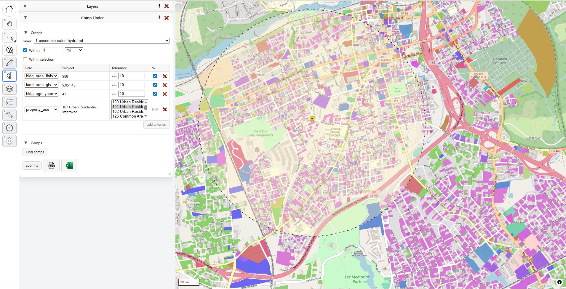
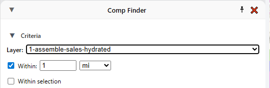
The “subject” parcel is the one I want to find comparable matches against, and it’s marked with a yellow pin. The marked radius represents my search distance, but if I want I can tell it to only find comps within a manual selection of parcels, too. Note that I can also change which layer I’m looking for comps on. Right now I’m looking for comparable sales, so I’m targeting the sales layer, but there’s no reason I couldn’t just look for physically similar properties by targeting the universe layer.
The most important part is the criteria section:
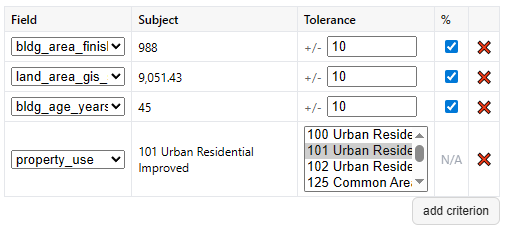
These fields define what counts as a comp. A few defaults are picked for me based on building size, land size, building age, and property use, which I can either disable or remove if I don’t like. I can also add new criteria. For numeric criteria, I can define distance in terms of absolute value (+/- 500 square feet) or in terms of relative value (+/- 10%). Once I’m satisfied, I click “find comps,” and all my matches show up on the map, and in the panel below.
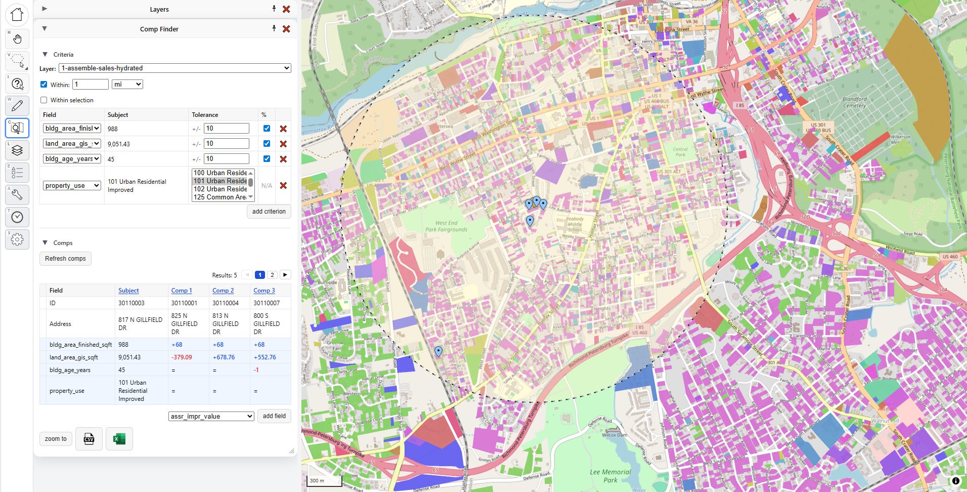
The comps are listed below in a “Comp Grid,” which shows the parcel key and address, along with the matching criteria relative to the subject. I can also add a new field to the grid if I want more information. New fields added this way won’t drive comp matches, but they will show me how the comps differ from the subject.
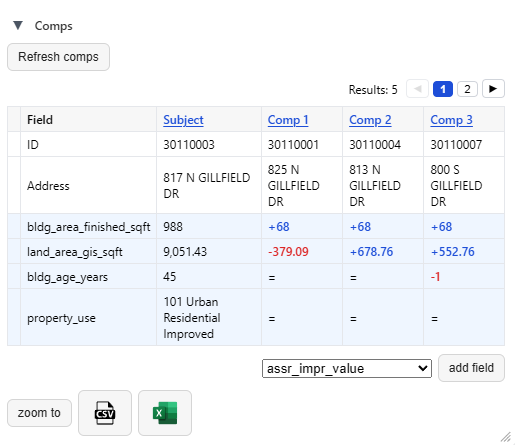
In this case I can see that the first three comps are all 68 square feet larger than the subject, with small differences in land size, and all but one are the exact same age. The buttons at the bottom let me export this comp grid to a spreadsheet.
In the future we plan to add the ability to add priced “adjustments” to comp grids, so that they can be used as visual aids in in property tax protest hearings—not just by the appellant, but also the assessor!
When both sides have the best possible tools, we can feel much more confident about the quality of our property tax valuations.
Future Work
…and that’s about it for the Put It On A Map visualizer. There’s a few other features in there that we haven’t covered, like the ability to edit fields, and a very clunky export function that’s honestly nowhere near ready yet, but we’re steadily working on improving this over time in partnership with real assessors in the field.
The main thing we want to add next (beyond feature upgrades and some overdue bugfixes) is a desktop and/or hosted database-backed version that anyone can deploy themselves easily. That’s a pretty big lift, so if you find this tool interesting and want to see it more widely developed and deployed, please donate to the Center for Land Economics.
Tool #2: Data Fetcher
What, did you think we were done? We still have three more goodies to show you today! Next on the list is the GIS Data Fetcher.
Having a fancy schmancy GIS visualizer app is of no use if you don’t have any data. Where can you get some data? From local government open data portals, that’s where!
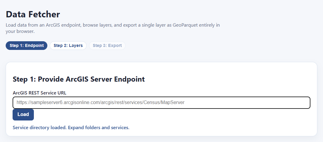
All you have to do is find an ArcGIS server endpoint with the data you want, paste it into the bar on this page, and hit load!
Um… what’s an “ArcGIS server endpoint?”
What’s that, you have no idea what I’m talking about?
Fear not, I’ll explain. By the time I’m done with you, you’re going to be the coolest person in the office and everyone will think you are a magical wizard. Here’s how to find free, public data provided from a local government near you.
Step 1: go to your favorite search engine and type: “<name of location> open data portal”

If your jurisdiction is cool, one of the first few hits will be something like this:

Step 2: Ignore all the official search tools and make a beeline for the first thing that looks like an interactive web map.
It doesn’t really matter which interactive map you click on, because they all tend to be hooked in to the same underlying data sources. Ideally you’ll find a parcel map, but even if you can only find a map of school district boundaries or something, that should work too. Just find any interactive web map:
Step 3: Find the ArcGIS server endpoint
Now for the magic. With the interactive map open, hit F12 on your keyboard. You should see something like this pop up at the bottom, find the tab that says “Network” and click it:
What you’re looking at is a list of network requests. Let me explain what this means, because although it looks complicated, what’s going on is actually pretty simple.
When your browser loads a page, what usually happens is it first tries to load a basic page as quickly as possible so that the user doesn’t think the page is frozen, and then asks the server for additional content to fill in, putting in little spinners and loading bars until the whole page is ready. Each request for more information from the backend database shows up in the bottom panel here. That means if you know where to look, you can find the exact address of the server that’s feeding the map as you click around, and you can download data from directly from that server using our tool. All you need is the server’s name.
Next step: with the network requests panel open, and your eyes on the map, refresh the page. This way you’ll see all the requests, including the ones that happened before you opened the panel.
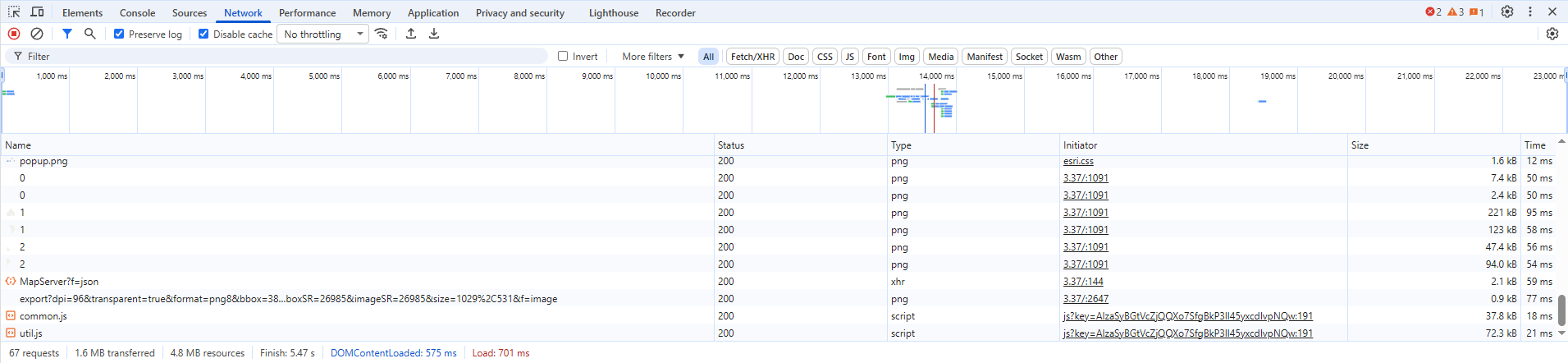
For good measure, zoom all the way in on a detailed part of the map or click on some things to try to get it to load more information, until the panel fills up. Next step is to filter the list down, because it can get literally hundreds of items. Find this section at the top and click “Fetch/XHR”, this will remove a bunch of irrelevant stuff like loaded images and other stuff we don’t care about:

There’s still a lot of stuff left, but don’t worry, I’ll guide you. What we’re looking for specifically are ArcGIS server endpoints.
ArcGIS server is a specific piece of software produced by ESRI, which powers the backend for approximately all of the online web maps like this one.
We’re specifically looking for URL’s that have “query” in the title, and especially “arcgis” or “gis.” The pattern can vary, so also look for “rest/services” and “MapServer.” The server won’t always be obvious from the data in the “Name” field alone, you’ll have to look at “Request Url” on the other side, but if you click on enough entries you will eventually find a likely candidate, like this:
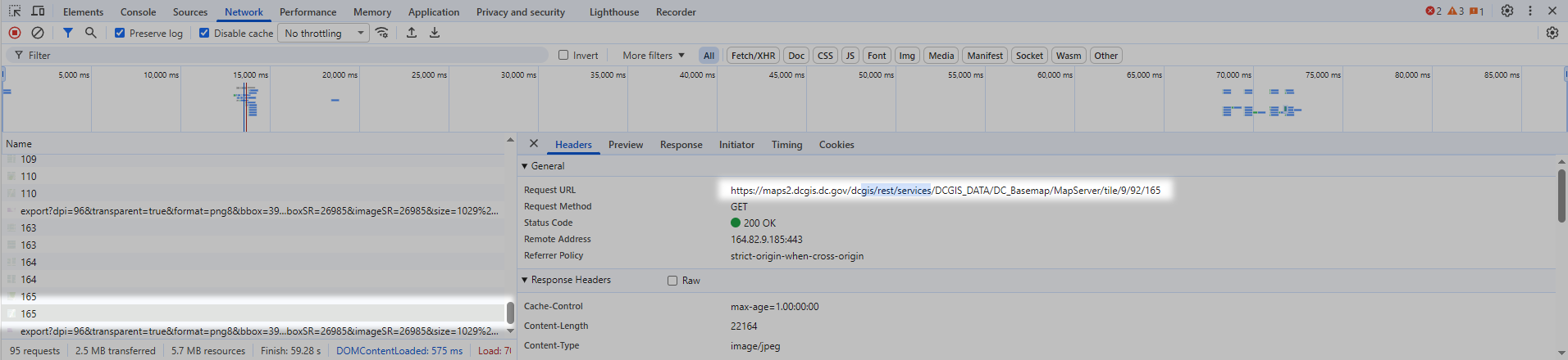
This is what we want. Go over to the right panel where it says “Request URL”, and copy that whole field:
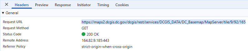
Here’s the endpoint for this jurisdiction:
https://maps2.dcgis.dc.gov/dcgis/rest/services/DCGIS_DATA/DC_Basemap/MapServer/tile/9/92/165
We’re going to strip off everything after “MapServer”:
https://maps2.dcgis.dc.gov/dcgis/rest/services/DCGIS_DATA/DC_Basemap/MapServer
Now we simply stick that server endpoint into our Data Fetcher.
NOTE: in case you were wondering, you are not doing any elite hacking here (sorry to disappoint you). You are requesting publicly provided information that is being freely broadcasted by a local government, that was already being downloaded to your computer every time you interacted with one of their maps. If they were trying to restrict you, they would require a password with the request.
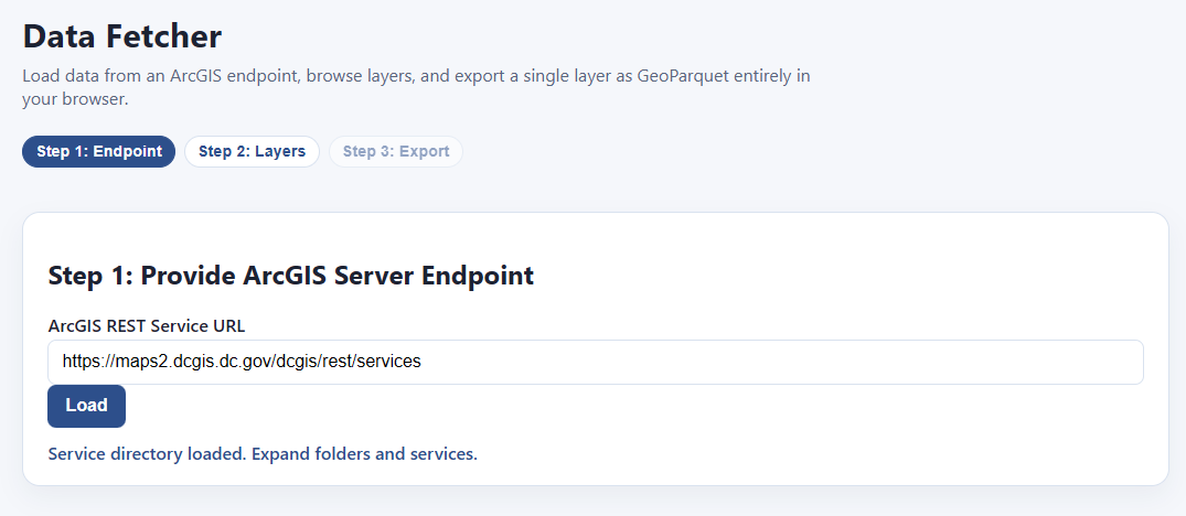
Click load, and bam! We can now download any or all of these layers, and export them directly as GIS-ready files:
Of course, this particular layer isn’t all that useful. It’s just literally one polygon, the boundaries of Washington DC. However, we have another trick up our sleeves. Let’s look at that URL again:
https://maps2.dcgis.dc.gov/dcgis/rest/services/DCGIS_DATA/DC_Basemap/MapServer
There’s probably more data here, we’re just in one of many subdirectories. If we back up to the end of “services” I’m sure we’ll find the root menu:
https://maps2.dcgis.dc.gov/dcgis/rest/services
Let’s try it:
Sure enough! Here’s all the data:
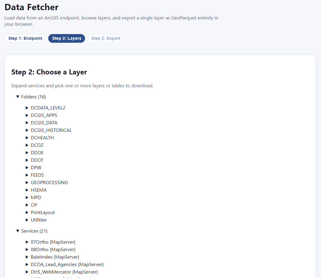
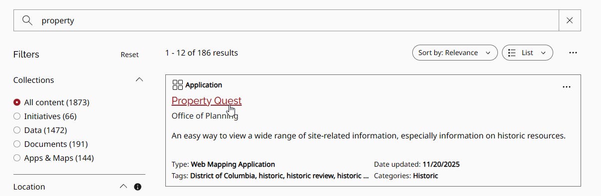
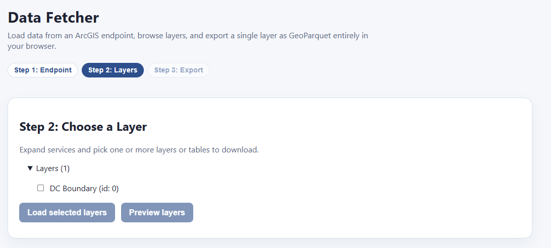
Each of these has its own expandable category. Folders/DCGIS_Apps/PropertyQuest (MapServer)/Layers/Lots/ seems pretty interesting:
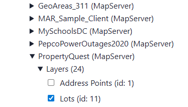
We can check as many as we like, and then, before we commit to downloading them all (which could be quite large), we click “preview layers” to see what we’re getting:
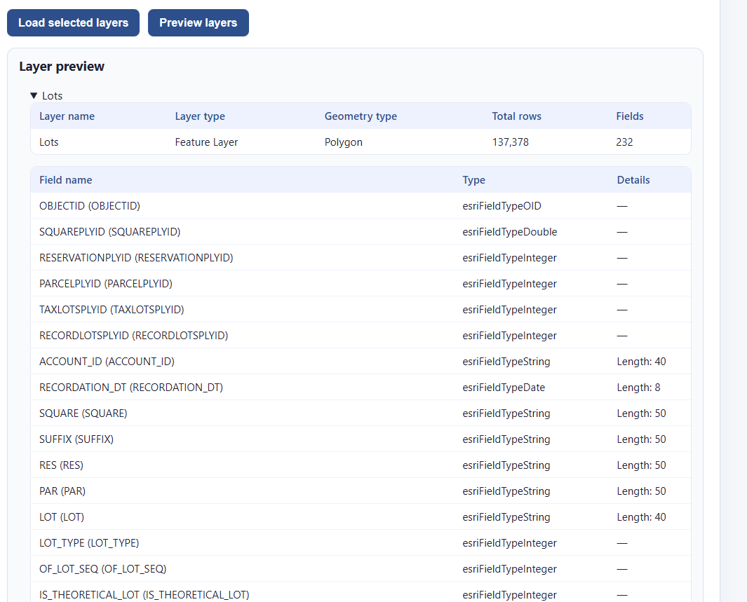
This is 137,378 rows long, and has all the fields we would expect. This is what we want. Let’s go ahead and select “Load selected layers”
That takes us to this screen:
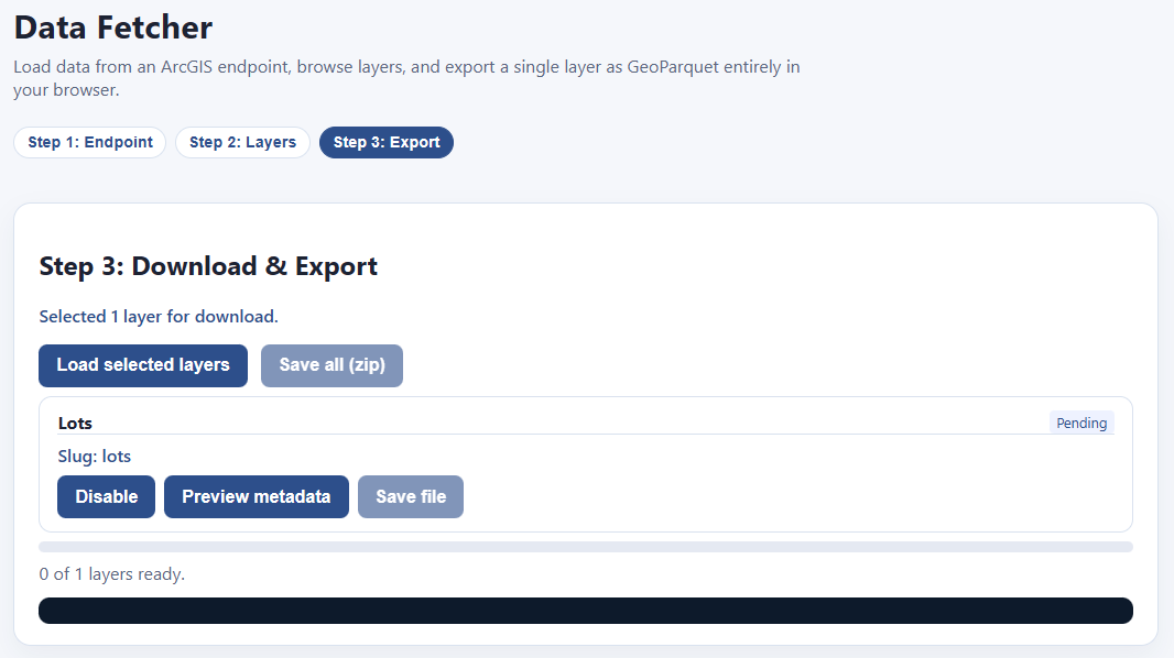
Hit “Load selected layers” and the downloading begins!
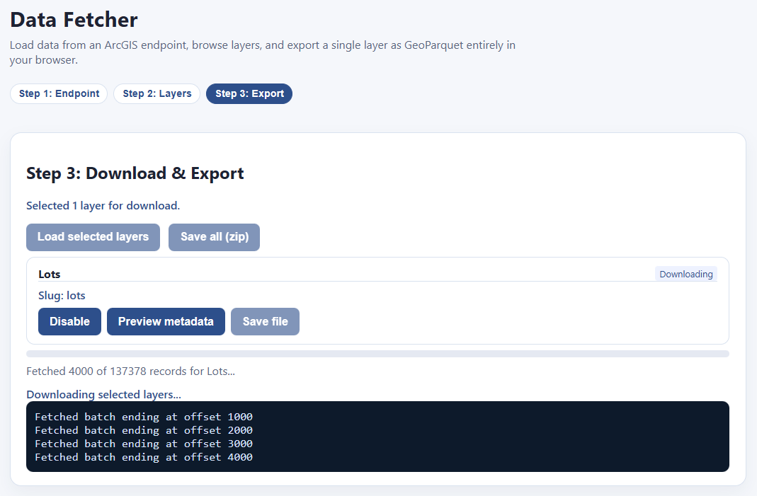
Once your download is finished, the “Save file” button highlights, and you can download your file as a parquet. If you have multiple files downloaded, you can save them all as a zip file.
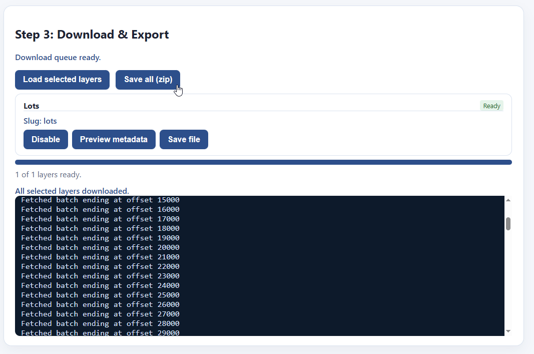
And that’s it! Now you have your files!
NOTE: Files you download this way will not always be ready to put directly into our visualizer, because a) really big files will make your computer choke on memory limits, and b) the coordinate reference system might not be compatible out of the box. We’re working on tools to address that.
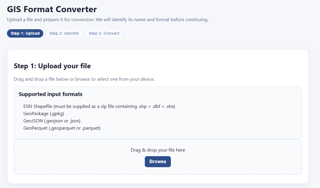
Tool #3: GIS Format Converter
What if you already have data on your computer, but it’s in the wrong format? The most common GIS format in assessment offices is the ESRI Shapefile, which goes back to the early 1990’s and has a lot of limitations. Our visualizer app only supports parquet, which is way more efficient—it’s a smaller file size, supports longer field names, handles data better, and loads much, much faster. If you’re using QGIS, you’d also benefit from using parquet format (or at least geopackage) over ESRI shapefiles.
Never fear, the GIS format converter is here! Simply select your GIS file, then convert it to a fancier format with a click! Start by putting your file here:
The system processes it:

And bam! You can convert and save it to either geoparquet or geopackage format:
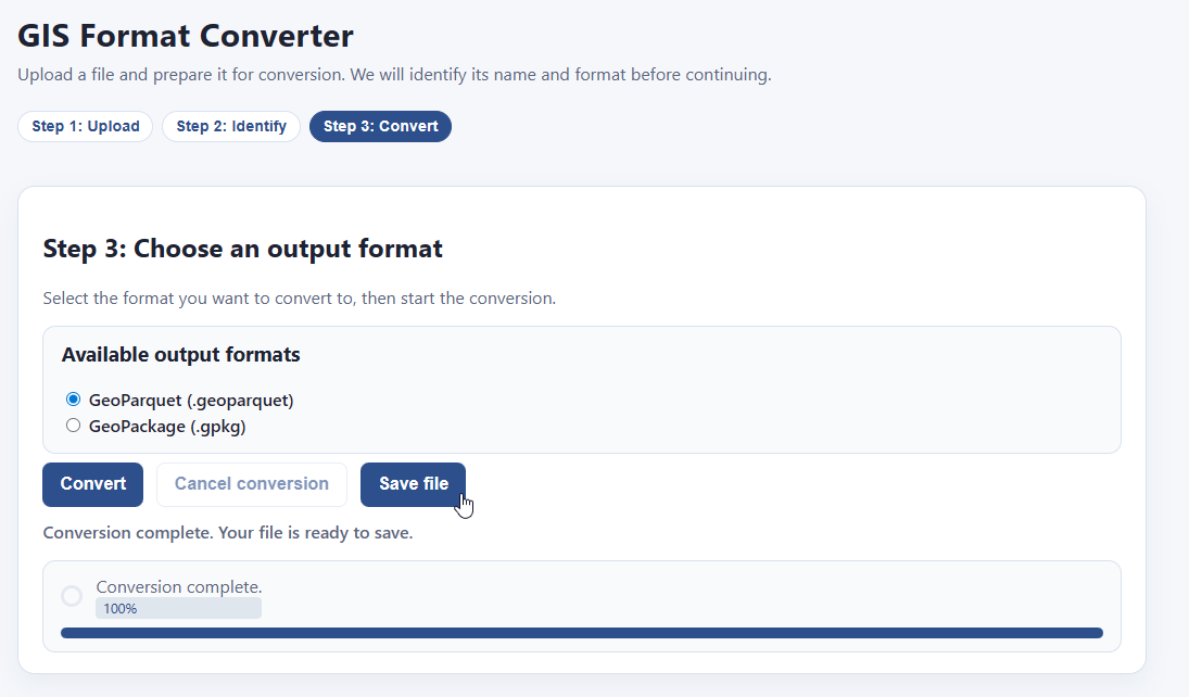
That’s it! That’s all this tool does. Very handy.
Tool #4: GIS Construct
Let’s say you have two data files — one contains parcel geometry, and the other contains parcel data. How do you join them? Normally you would need SQL, python, or a GIS app like QGIS or ArcGIS. Or you could just use PIOAM’s Construct utility:
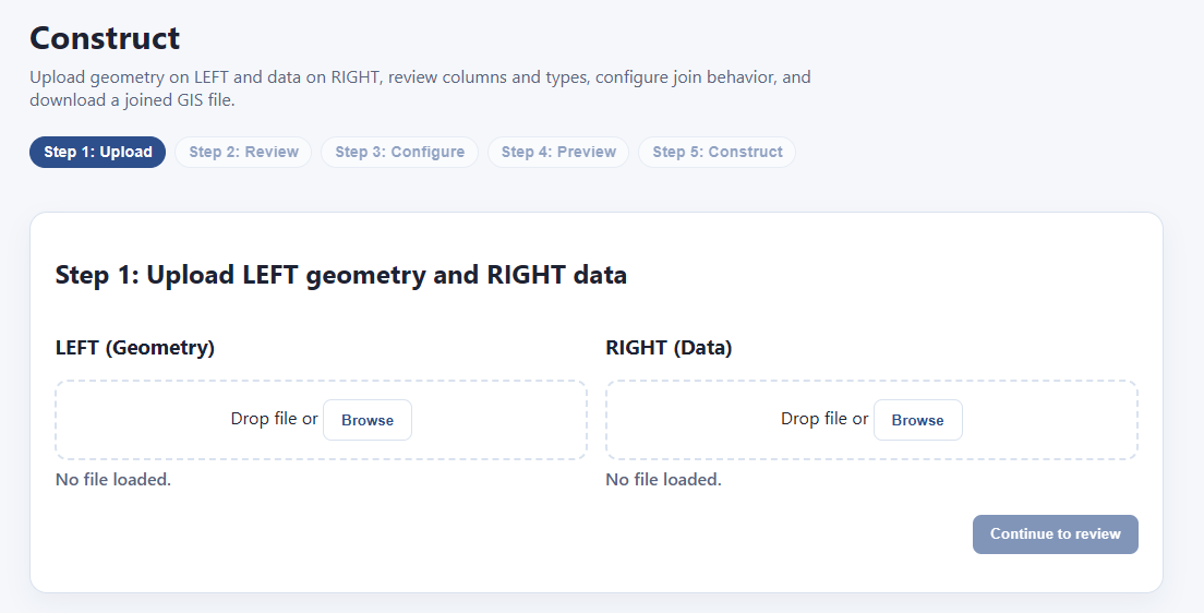
The way this works is that we have a “left” side and a “right” side. You upload the file with your geometry to the “left” and the rest of your data on the “right”. Then we’ll go through and join them.
We drop some files in and it loads their data:
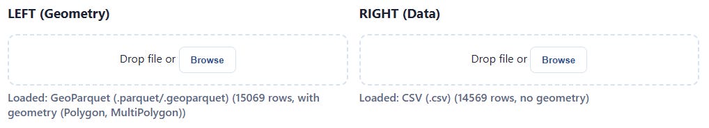
If one of the files is a CSV, it will ask for your guidance on how to parse it correctly, and show you a preview of the results you’ll get, so that it doesn’t make a mistake:

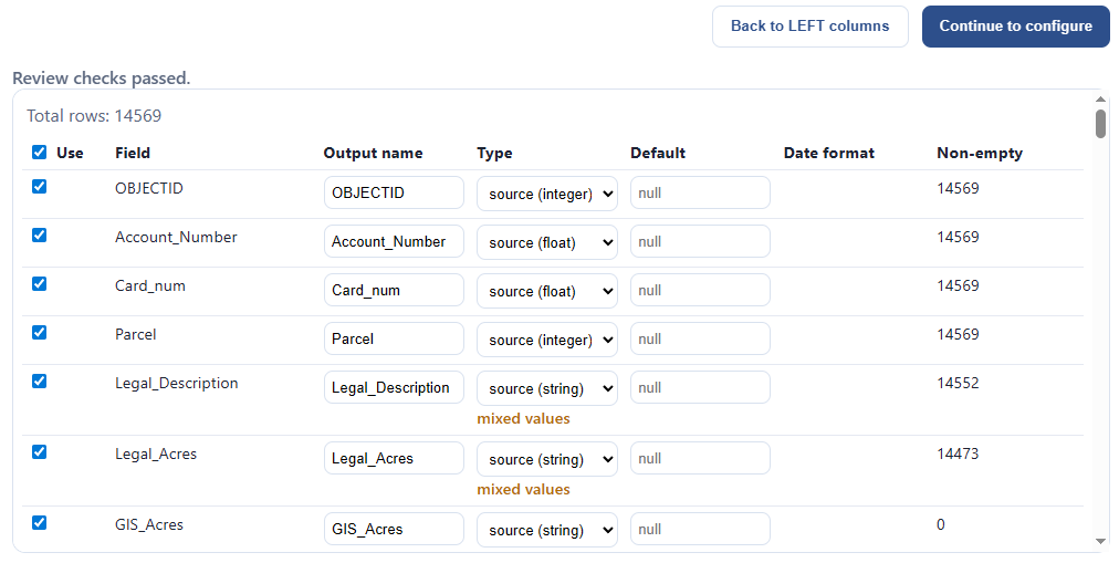
When we’re ready, we click “continue to review.” Now we’re looking at each data source and making sure everything’s what we want. We can pick which fields we want, we can override the inferred field type for each column, and we can see how much data is actually in each field:
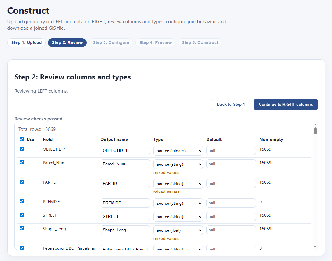
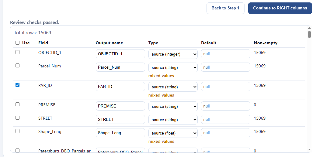
In this example, let’s say I want to throw away everything on the left except for the parcel id. I click the master “Use” checkbox to untoggle everything, then toggle “PAR_ID” alone. Then I click “Continue to RIGHT columns:”
Since the “right” data source was a CSV, I might want to check if all my fields are being properly interpreted, as CSV’s can mess up the types. I decide I’m going to keep the defaults, and “Continue to configure:”
Now we need to figure out the join logic. Fortunately this next step will help us with this. It loads up and gives us some options:
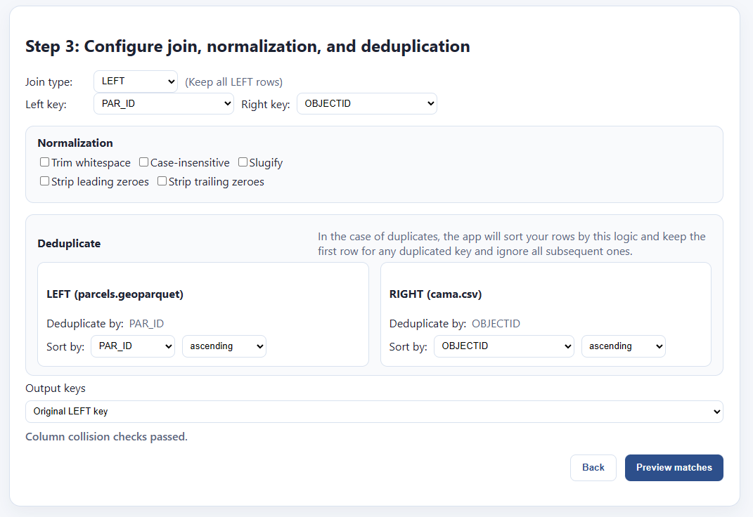
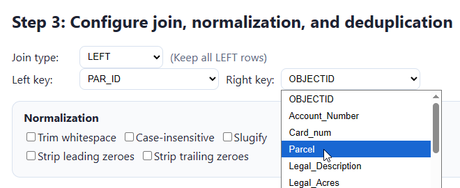
We’re trying to find a field on the LEFT that will join up with the RIGHT. It’s automatically made some guesses for us, but it guessed wrong on the right, “OBJECTID” isn’t the field I want. If I click “Preview matches” it will show that I have 0 matched rows by using that key:
I go back and I select “Parcel” instead:
This is good enough for my use case, but let me explain the rest of the interface for completeness sake. First, normalization:

Sometimes one file will have keys formatted like “000123 456 abc 11” and another will have the same keys, but formatted like “123456ABC11000”. These are actually the same, but will not naively match with one another, because:
LEFT has leading zeroes: 000123 456 abc 11
RIGHT has trailing zeroes: 123456ABC11000
LEFT has lowercase letters: 000123 456 abc 11
RIGHT has uppercase letters: 123456ABC11000
LEFT has spaces as separators, RIGHT doesn’t
We need to clean all this stuff up so that the keys will match. We’ll get a live preview of how our keys will change when we click these various options, then we can test them out by clicking “preview matches.”
Next, we have to properly handle duplicate entries for the same key:
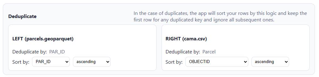
The app will drop duplicates by sorting each file by a chosen field, then dropping all but the first instance of the chosen key. So if “123” shows up eight times in the left side, only one of those will be picked. If I sort by, e.g. “sale_date”, ascending, then it will pick the one attached to the latest sale. If there’s no duplicated IDs in your dataset, there’s nothing to worry about here.
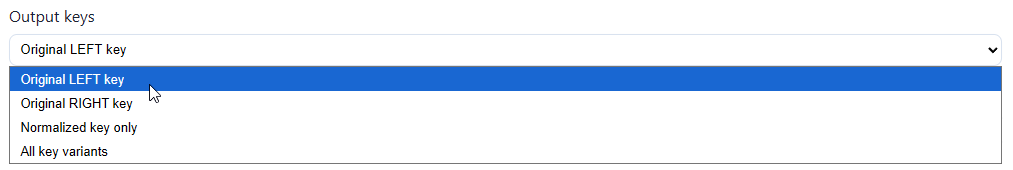
Next, we pick which key we want in our output file:
This screen will also tell us whether there are any collisions between columns in both data files — that is, whether they both share a column with the same name. If we’re good to go, we can preview matches.
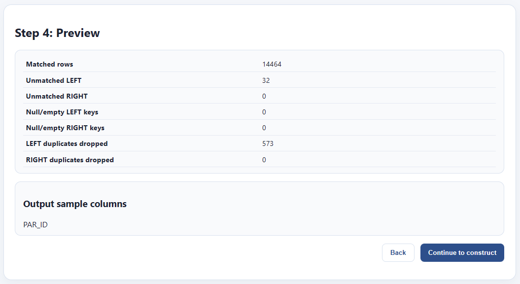
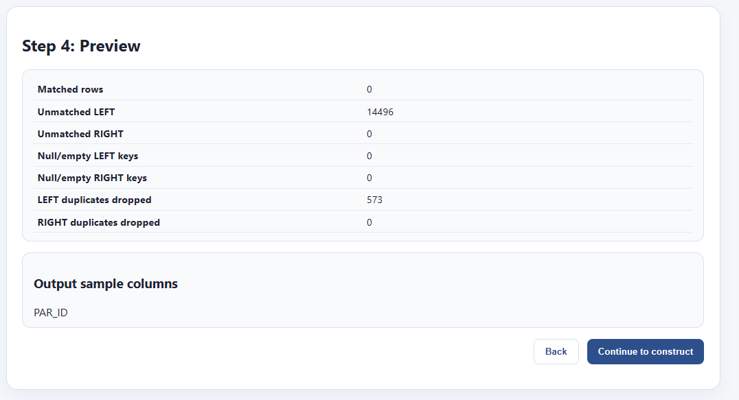
Everything looks good. The RIGHT data file is somewhat smaller, so there are 32 rows from the LEFT that are not matched. That’s fine. Also, we had some duplicate rows on the left, and we’re losing 573 rows. That’s also fine. The thing I care about in this case is that every row on the right, the one with my characteristics, is unique, and every one matched parcel geometry from the left. Let’s bake the file out.
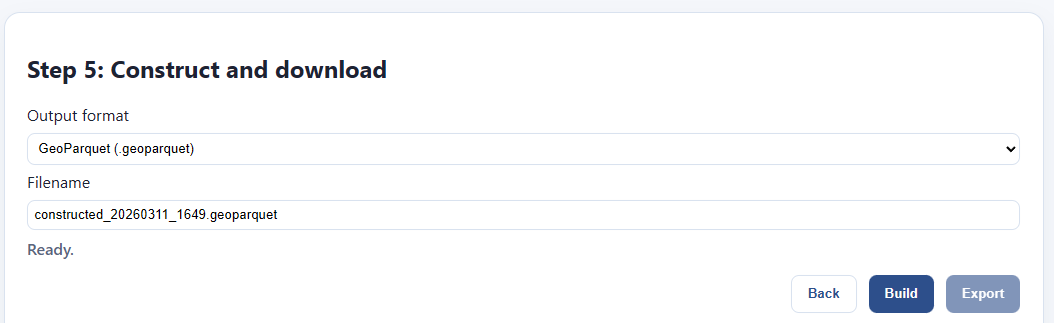
In the file step, I pick my format and file name. I click “build” and wait for the file to finish.
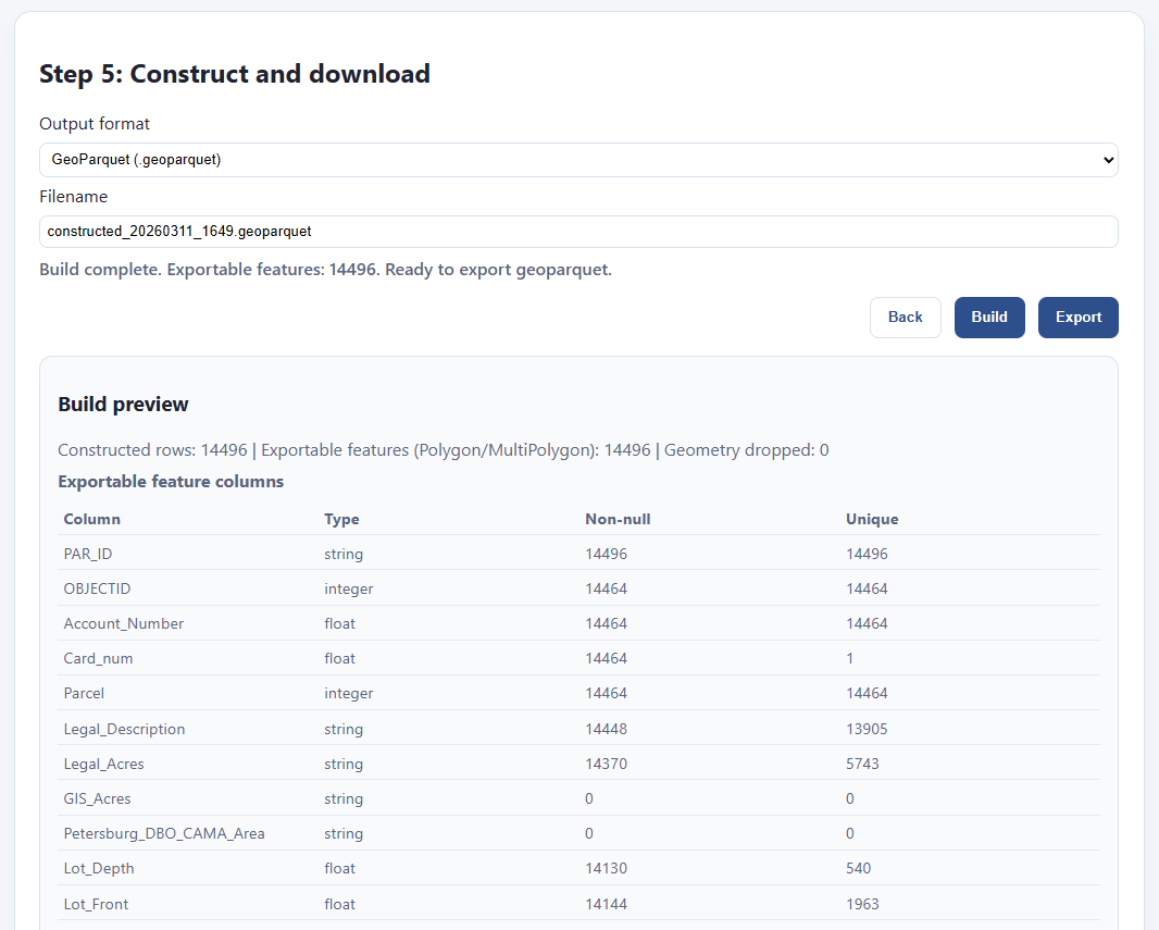
It updates with a preview of what’s in my file, and I can click export to save it. Here’s my file!

Further work
We hope these tools will be of use to not just us in the Land Value Return community, but also to the greater Urbanist movement, as well as civil servants and GIS professionals more generally.
We’re constantly working on refining and updating these tools, as well as producing tutorials, examples, documentation, and other training materials, but in order to do all that, we need your support and feedback. In addition to our labor, building the next generation of these tools, particularly those that require server hosting, incurs recurring costs. Your donations help us pay for all that and deliver more and better tools:
If you can’t give us money, however, the next best thing is to give us is your complaints. We want these tools to actually be used by people besides us, and I just know they’ve got lingering bugs, deficiencies, missing features, and edge cases I never thought of. The only person who can discover these is you. That’s why we want you to use them, break them, and then loudly complain to us about them (but politely!) Also, if you use any of our tools in your workflows or presentations, please let us know about it!
File your issues here, or join the OpenAVMKit discord (which has become a catch-all gathering place for all our projects) and complain there too.
Thanks for everything, we couldn’t do it without you. Let’s build all the things!
Depending on which exact parcels you pick, but it’s not hard to find such pairs.
QGIS is great, don’t get me wrong! It’s just trying to a million different things, and I found that it’s easier and faster sometimes to create a bespoke tool that only does the exact things I need in particular, exactly how I want them.
There are technically outbound connections for a few of the apps, but we’re not on the other end of them. For instance, the visualizer has to load base maps from Open Street map, and that has to be fetched remotely; but it fetches from Open Street map, not us. Also, the ArcGIS endpoint downloader is going to send network requests to those ArcGIS endpoints, that’s the whole point; but again, those are remote servers you’re choosing to connect to, not ours. Other than that, there’s no network requests. We do not collect nor store your data, nor do we want to, and if you don’t believe us, check out the source code yourself!
I’m not claiming this tool is 100% compliant with their standards, nor am I claiming that they endorse it. They almost certainly have no idea it exists. All I’m saying is I based it directly on their specifications as best I could.
(looking at maps)
(itsbeautiful.zoolander.gif)
This feels useful for when I advocate land value tax and someone asks me about farmers. I usually say "well this can be implemented at the local level and farming communities don't have to do it if they don't want to", at least about the US.
But I'm also thinking "this matters much more in urban areas where the land value is concentrated". And now I can just show people a picture.
Thank you for the kind and detailed explanation of the features